New York Magazine —
Helping readers effortlessly find the stories, voices, and topics they care about most.

Project Overview
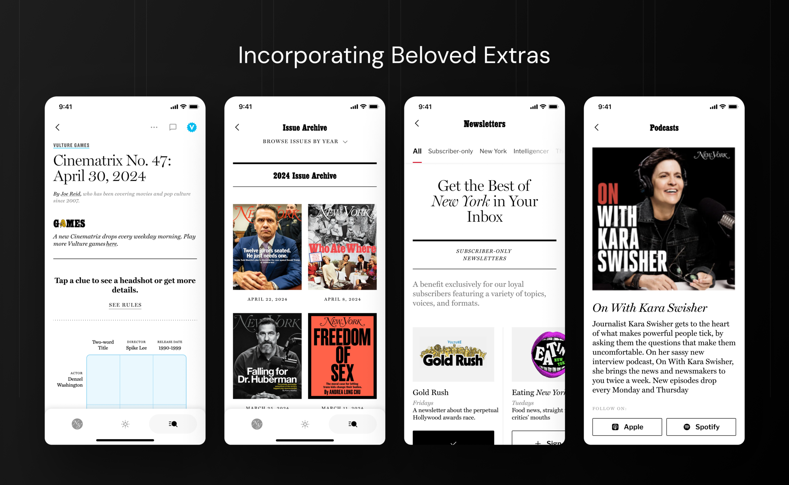
New York Magazine is a multi-platform editorial product that blends journalism, culture, and service-driven content into a single, highly navigable experience. It brings together distinct verticals—like news, culture, fashion, food, and entertainment—under one ecosystem, allowing users to move seamlessly between timely reporting and evergreen content.
Goals
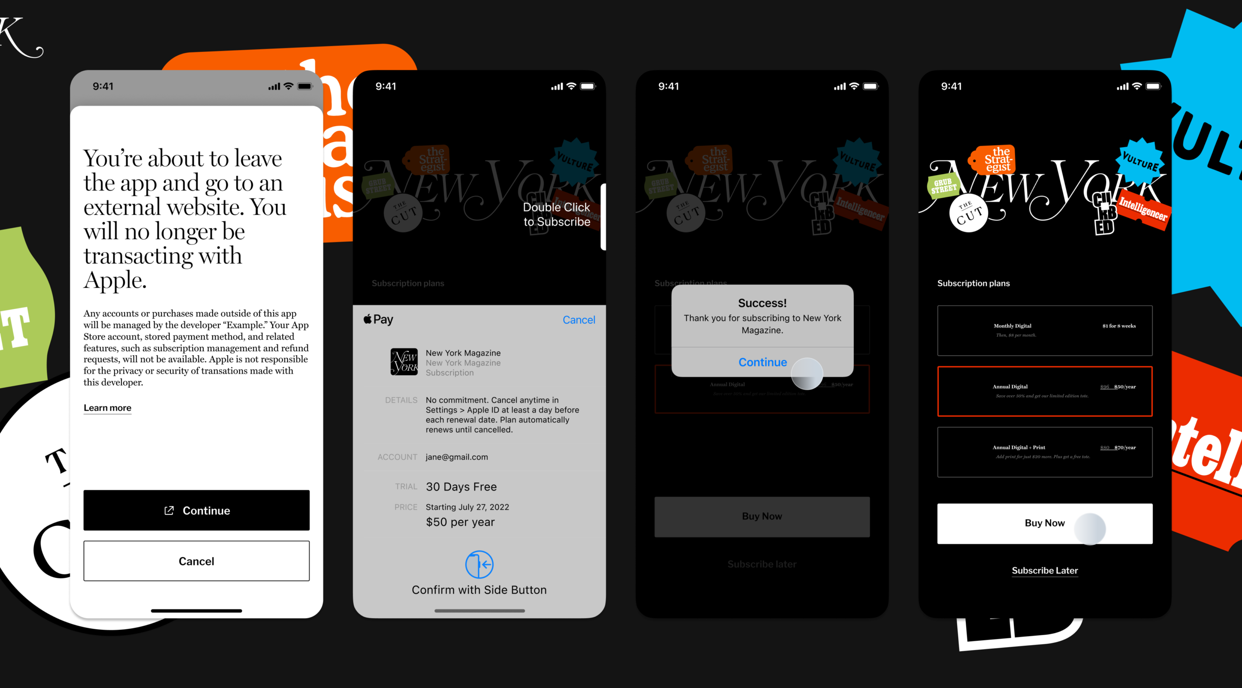
Offer a seamless native app for reading and primary features for a mobile-first experience
Promote easy navigation between verticals for all users with unique interests and reading patterns
Increase personalization of user feeds, encouraging exploration across a broader portfolio
Discovery
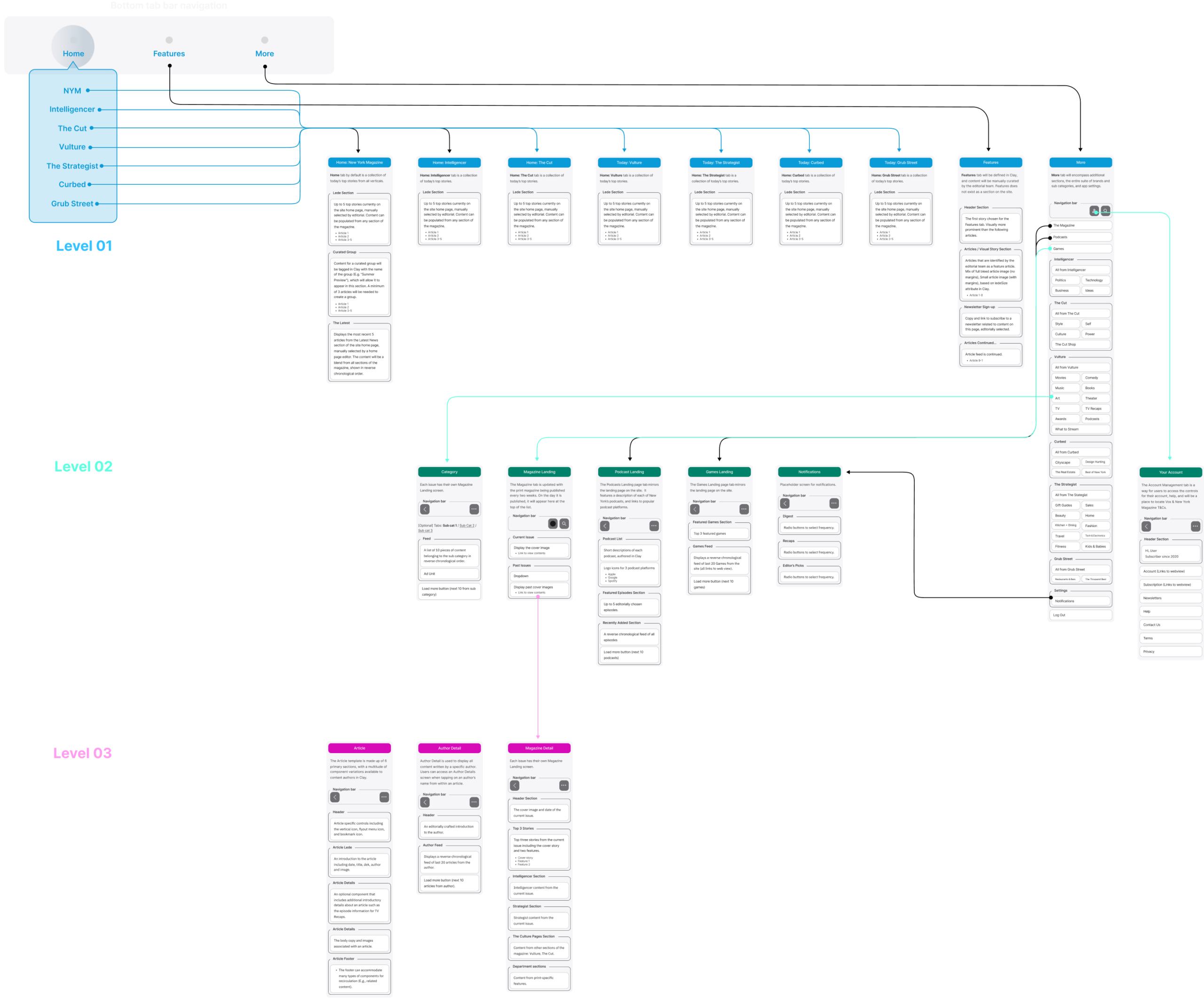
Clarifying information architecture
Nuances between verticals
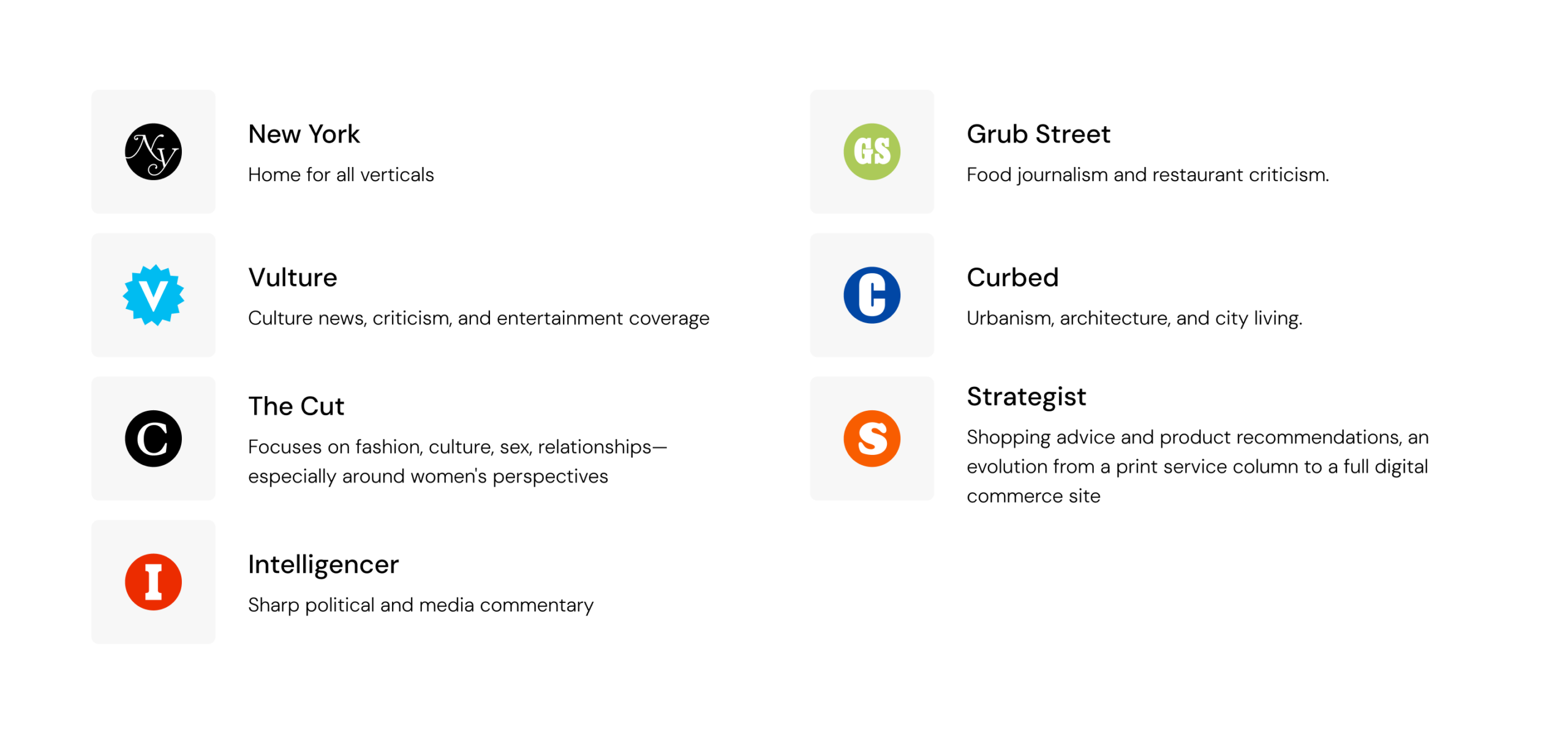
New York Magazine operates as a collection of distinct editorial verticals—such as Vulture, The Cut, and Grub Street—each with its own voice, audience, and content focus. While this breadth is a strength, it creates complexity in understanding how the ecosystem functions as a whole.
From a product perspective, it was challenging to build a clear mental model of how these verticals relate to one another and where audience behaviors overlap. The diversity of topics made it difficult to identify shared user needs, predict cross-vertical engagement, or determine how readers naturally move between sections—creating friction in designing a cohesive, intuitive experience across the app.
Browsing patterns
NYM had tried to track how users were navigating their site and what content they were browsing in order to create personas and determine how the app navigation should work. Uniquely, we entirely could not identify user patterns — user interests were too specific and browsing was too random. People would browse between verticals, articles, extra content; some came only for games and magazines.
Discovery
Approaching scope
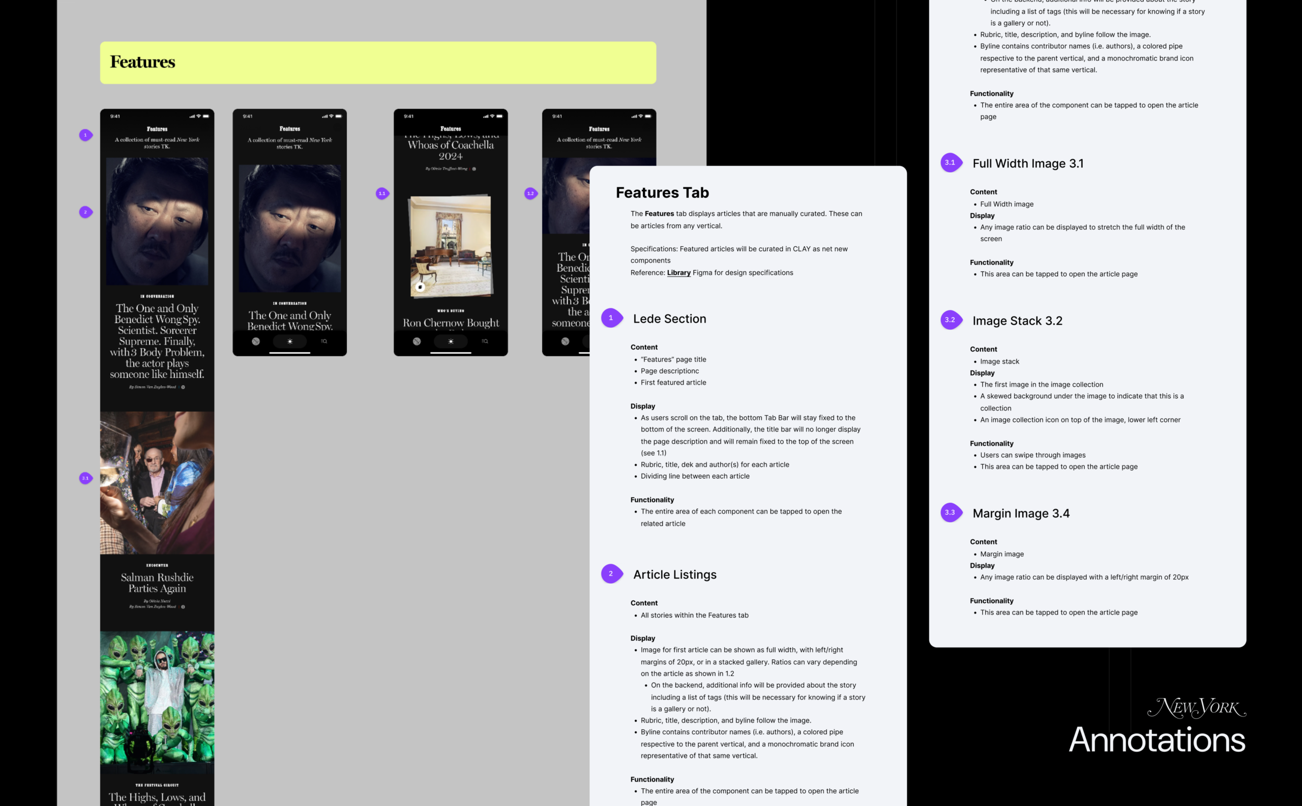
I started with solidifying requirements across the product, aligning on the core problems we needed to solve and the business goals we needed to support. This included defining the information architecture at a foundational level—mapping what each page needed to include, how content should be structured, and how users would move through the experience.
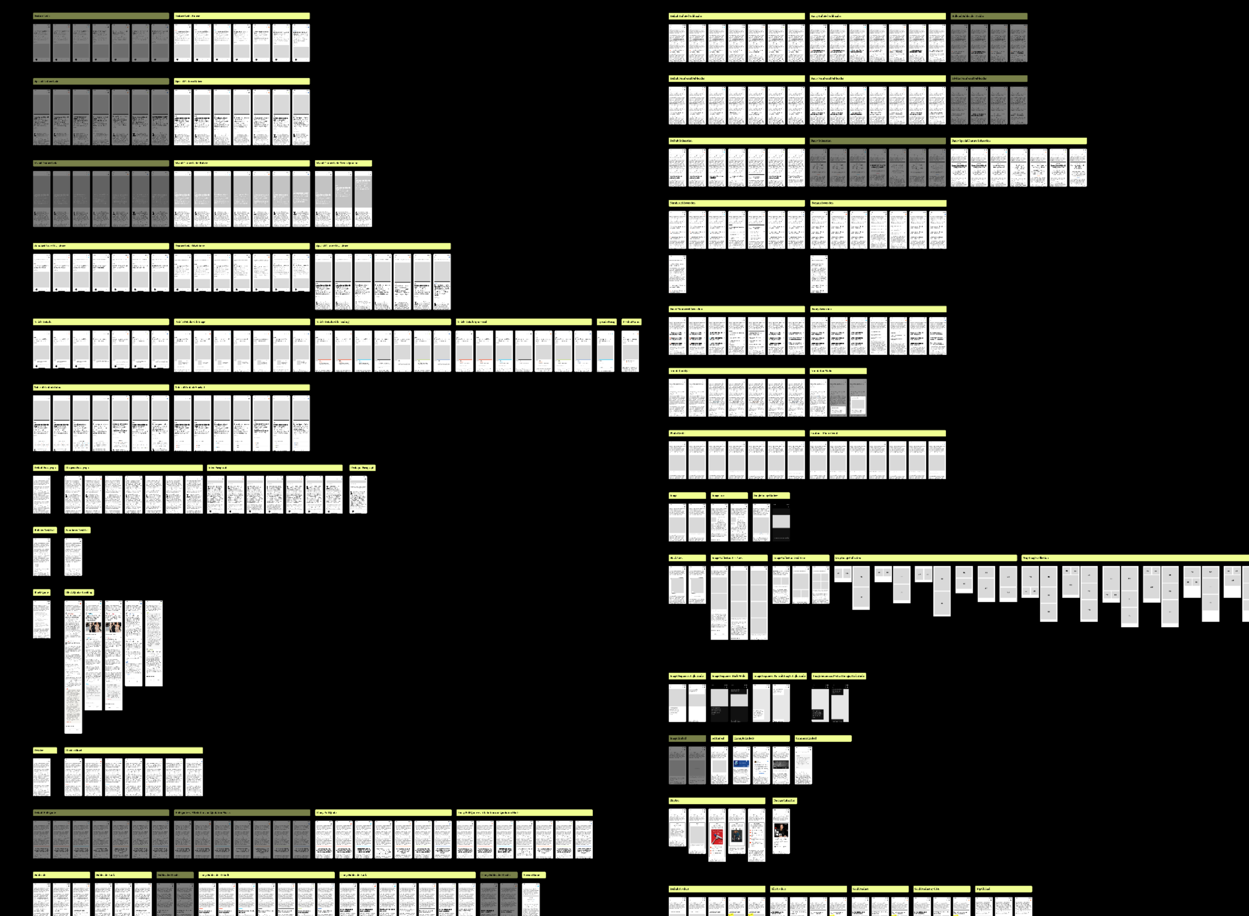
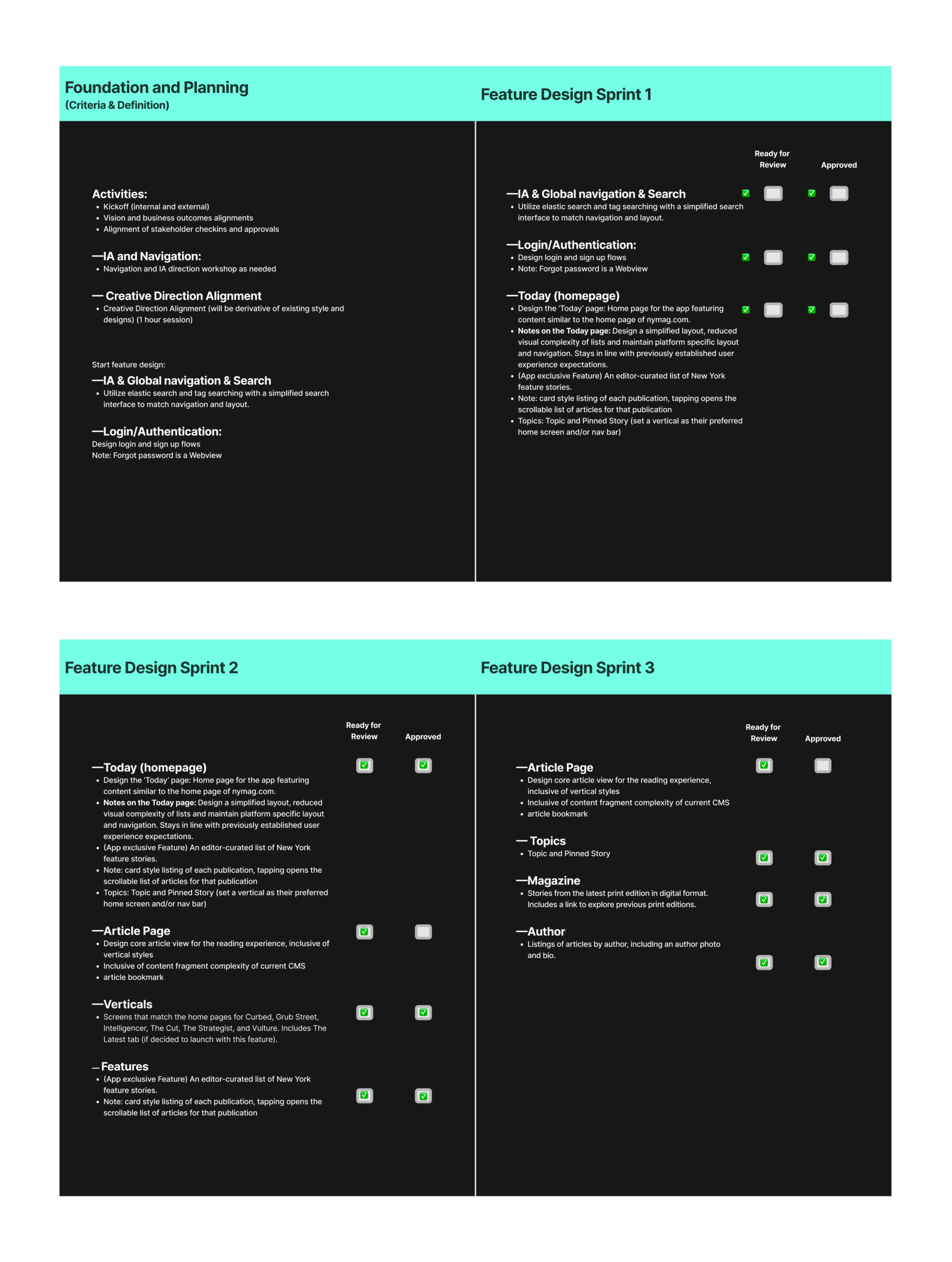
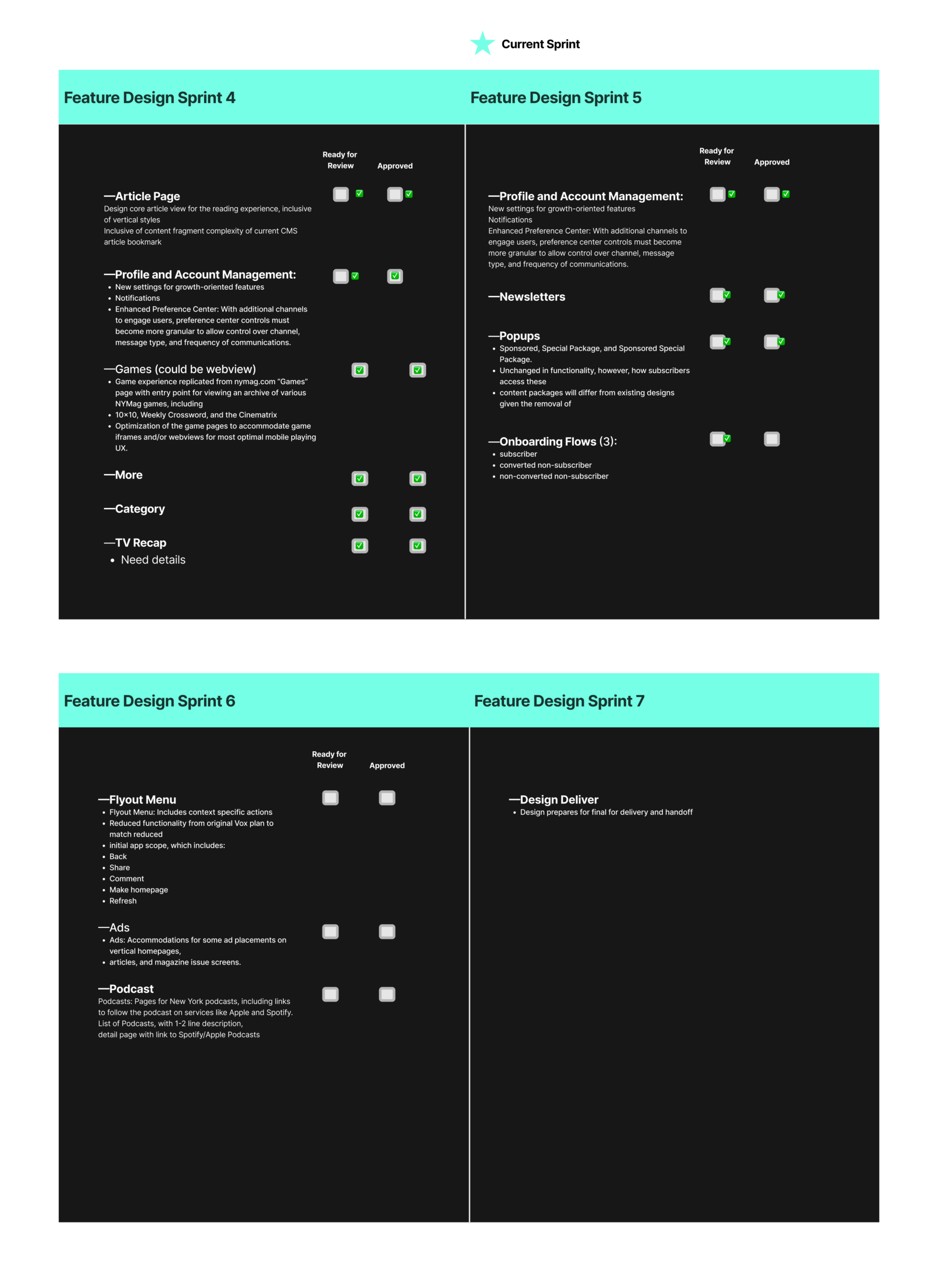
I organized this work into a collaborative FigJam board, creating a shared source of truth with my team. This allowed us to stay aligned on priorities, adjust scope as needed, and ensure we were moving efficiently. Given the scale and variety of content within New York Magazine, this approach served as a project tracker, helping us systematically cover every part of the app, making sure no key user flows or content areas were overlooked.
Design
Creating a seamless & cohesive ecosystem
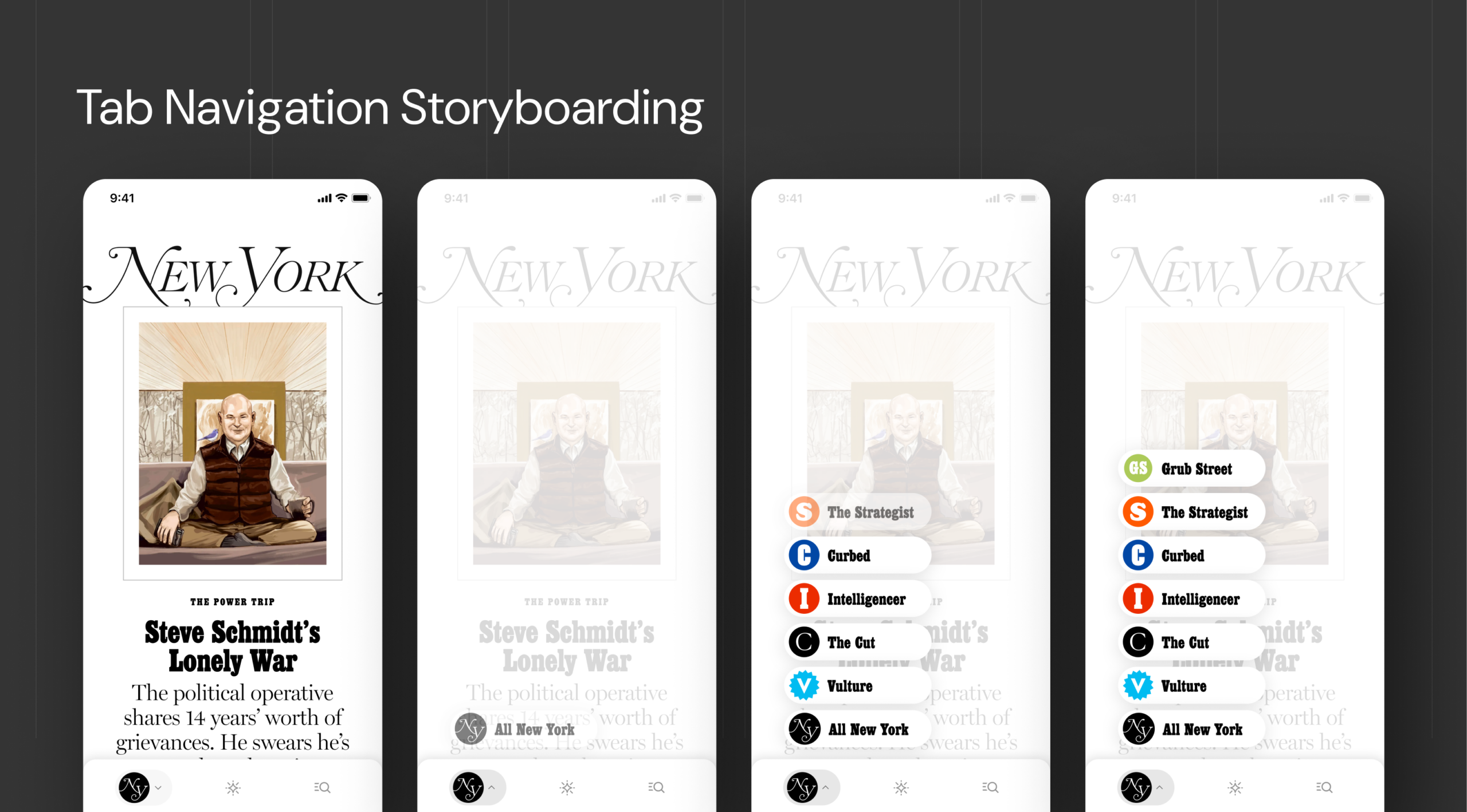
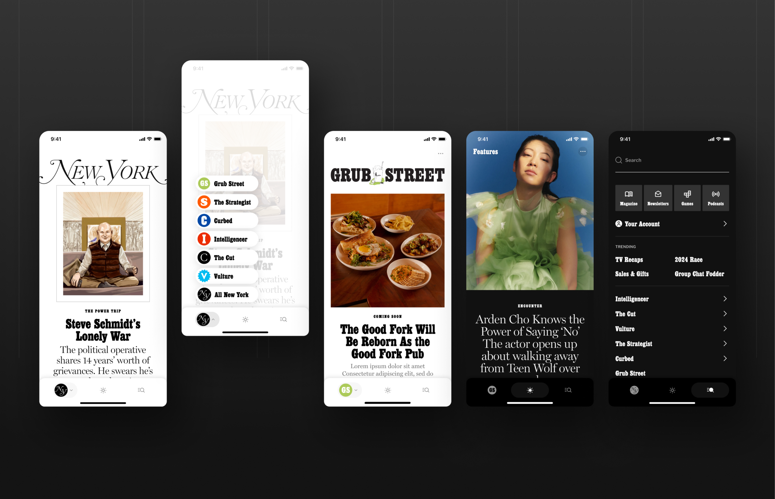
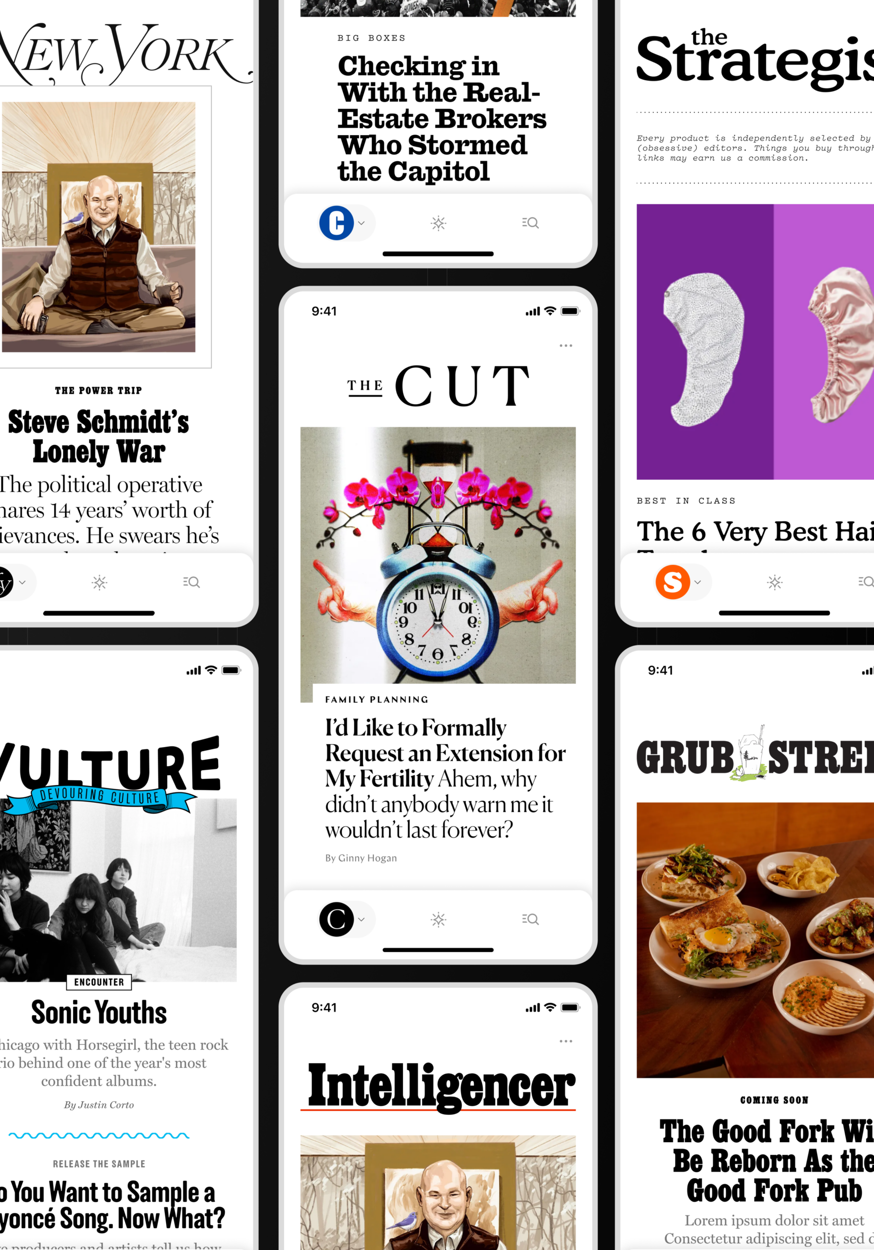
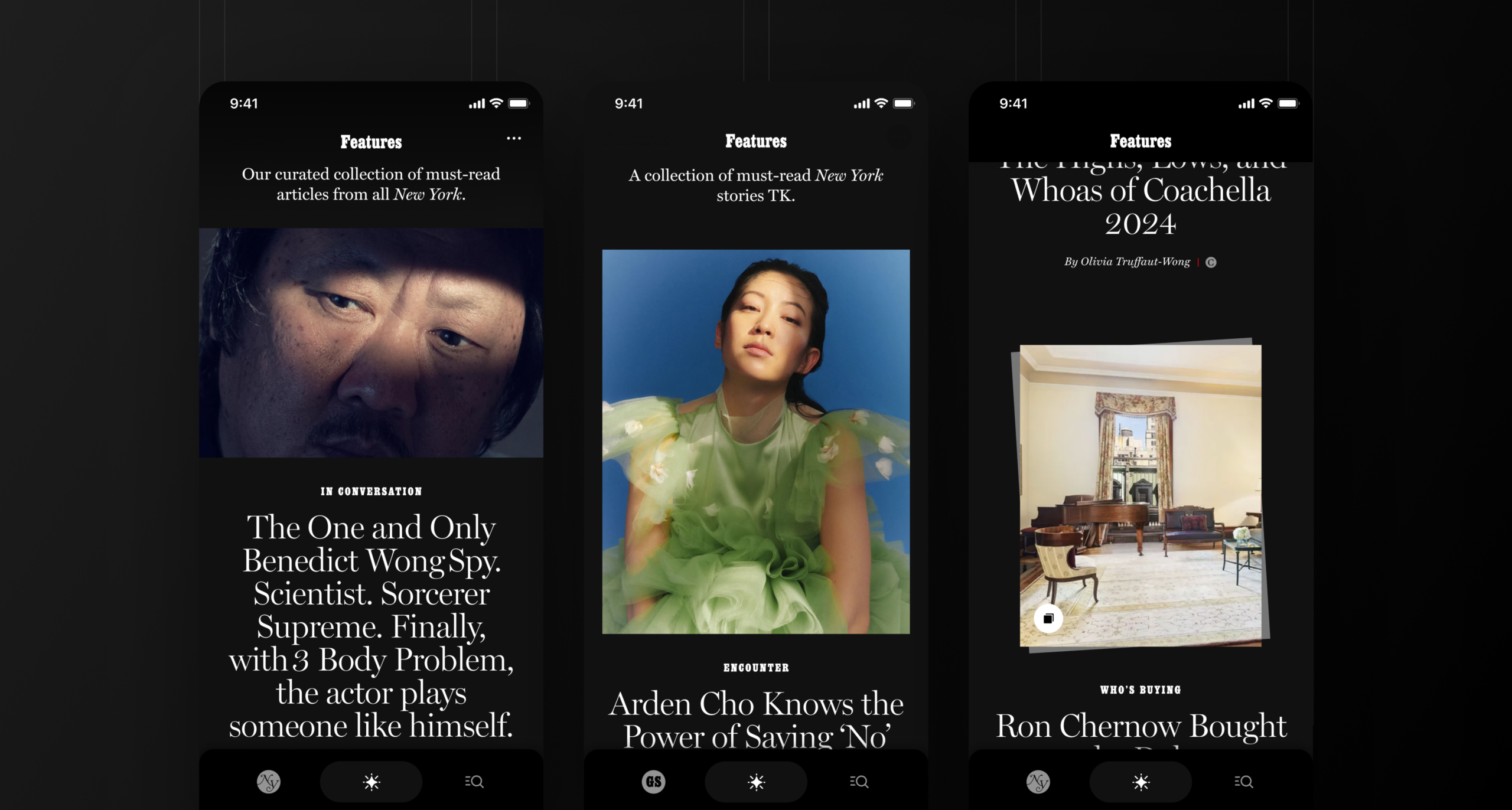
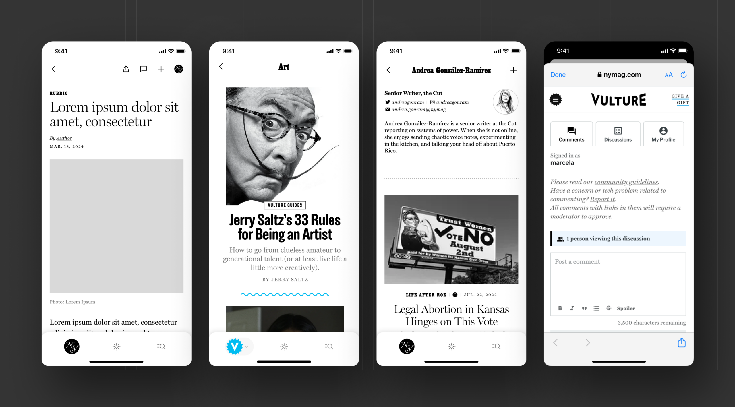
Creating a seamless navigation experience meant ensuring users could move across the entire ecosystem without needing to think about where they are. I introduced a consistent landing pattern, where each vertical begins with a familiar entry point, allowing users to quickly orient themselves and understand how to explore further.
I designed the experience so users can jump between content, sections, and verticals with minimal friction. Multiple, intuitive navigation pathways support both intentional browsing and passive discovery — making it just as easy to explore something new as it is to find something specific.
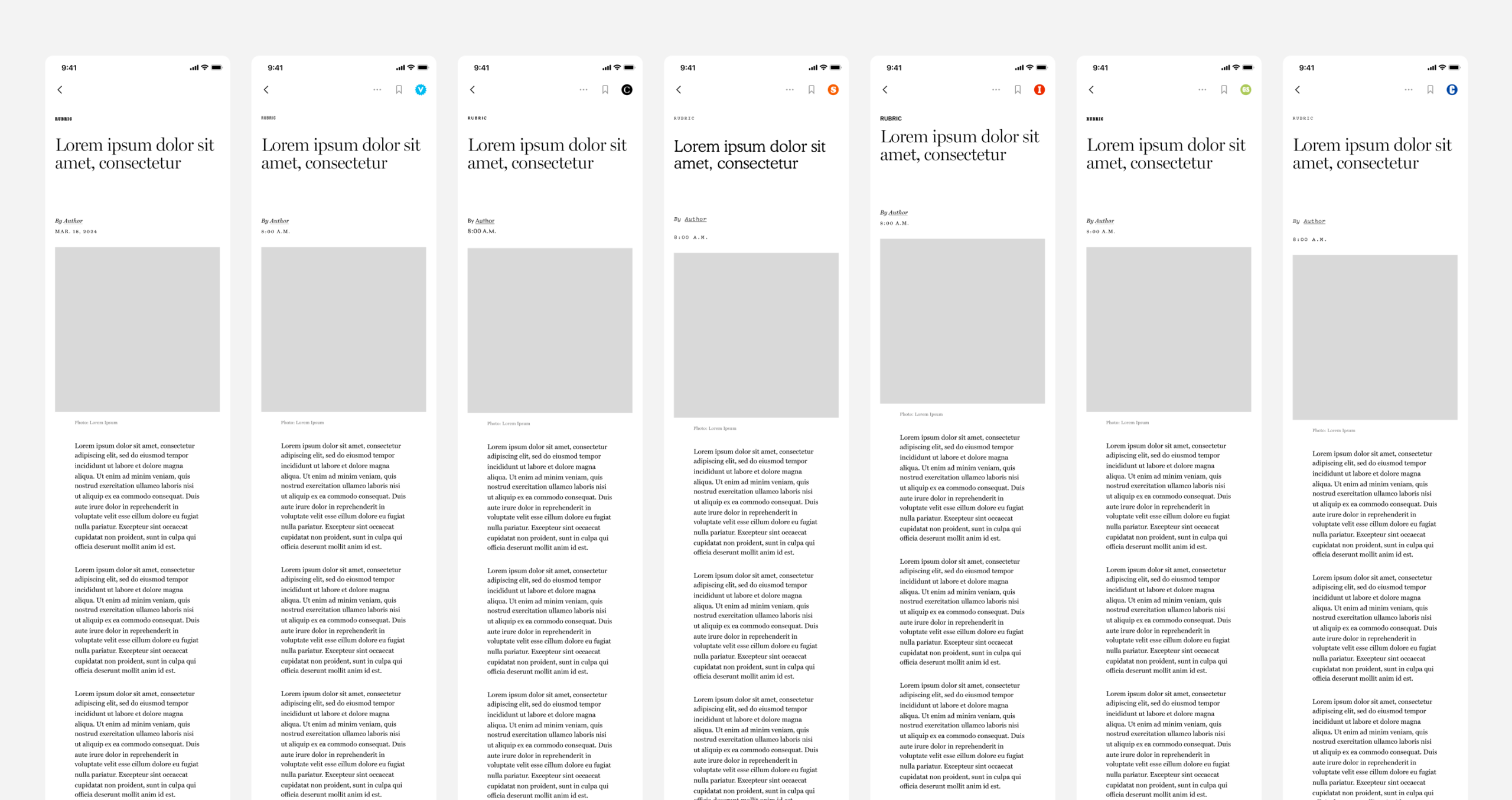
To reinforce this, I standardized key components and interaction patterns across verticals. While each maintains its own editorial voice and visual identity, the underlying structure remains consistent — so users are always met with a familiar, predictable experience no matter where they navigate.