LivePerson —
Revitalizing a companiable digital presence to create more meaningful connections between businesses & consumers

Project Overview
LivePerson's "Curiously Human" Conversational AI enables personalized experiences that drive increased value in commerce and care relationships. My main challenge was to rebrand LivePerson to make their AI feel more approachable and human.
Solutions

Expanding brand positioning into various digital platforms
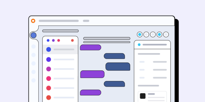
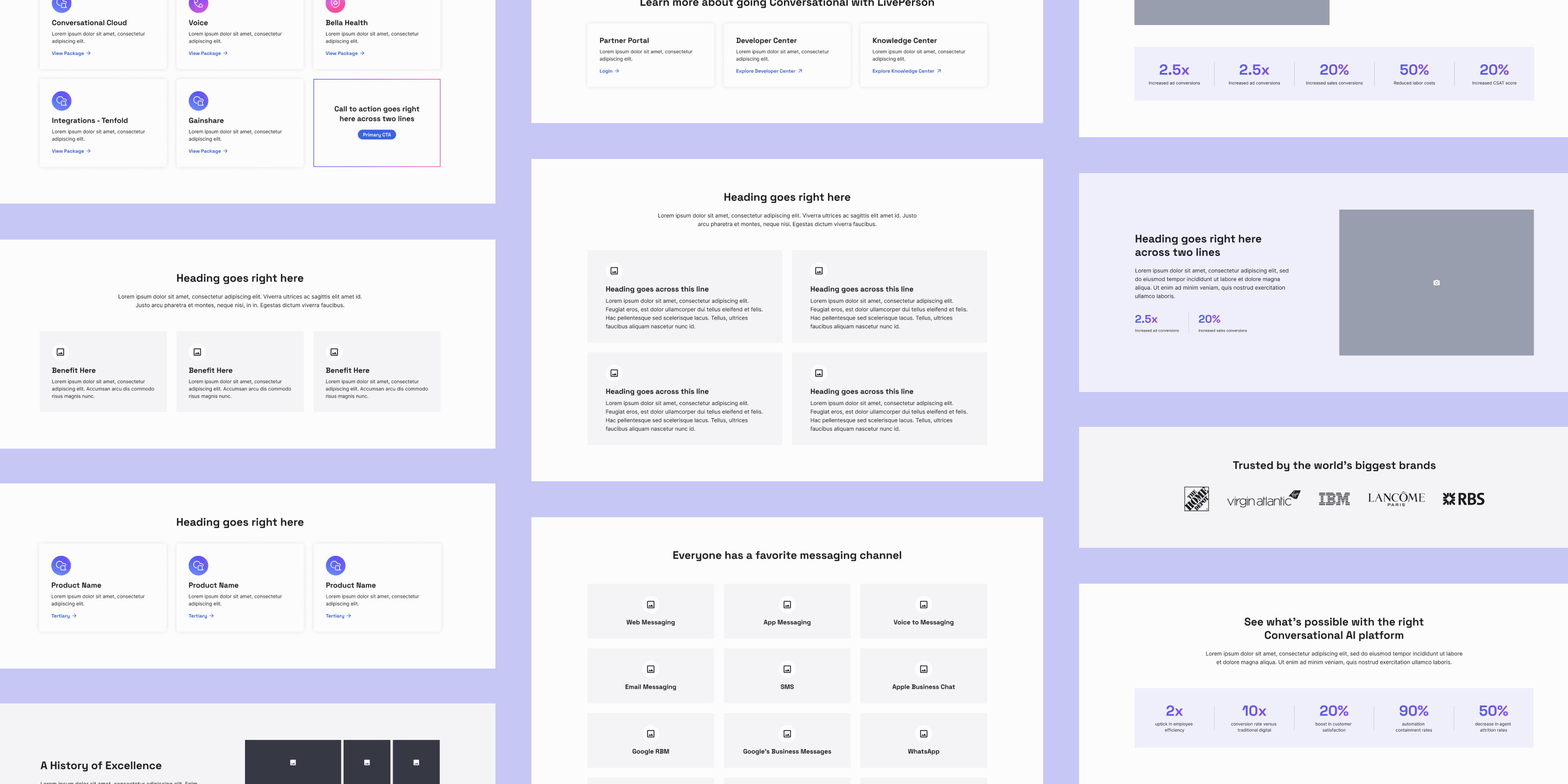
Enhancing marketing of key products & services
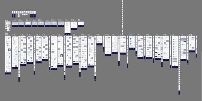
Laying groundwork for long-term growth in business and design
Research
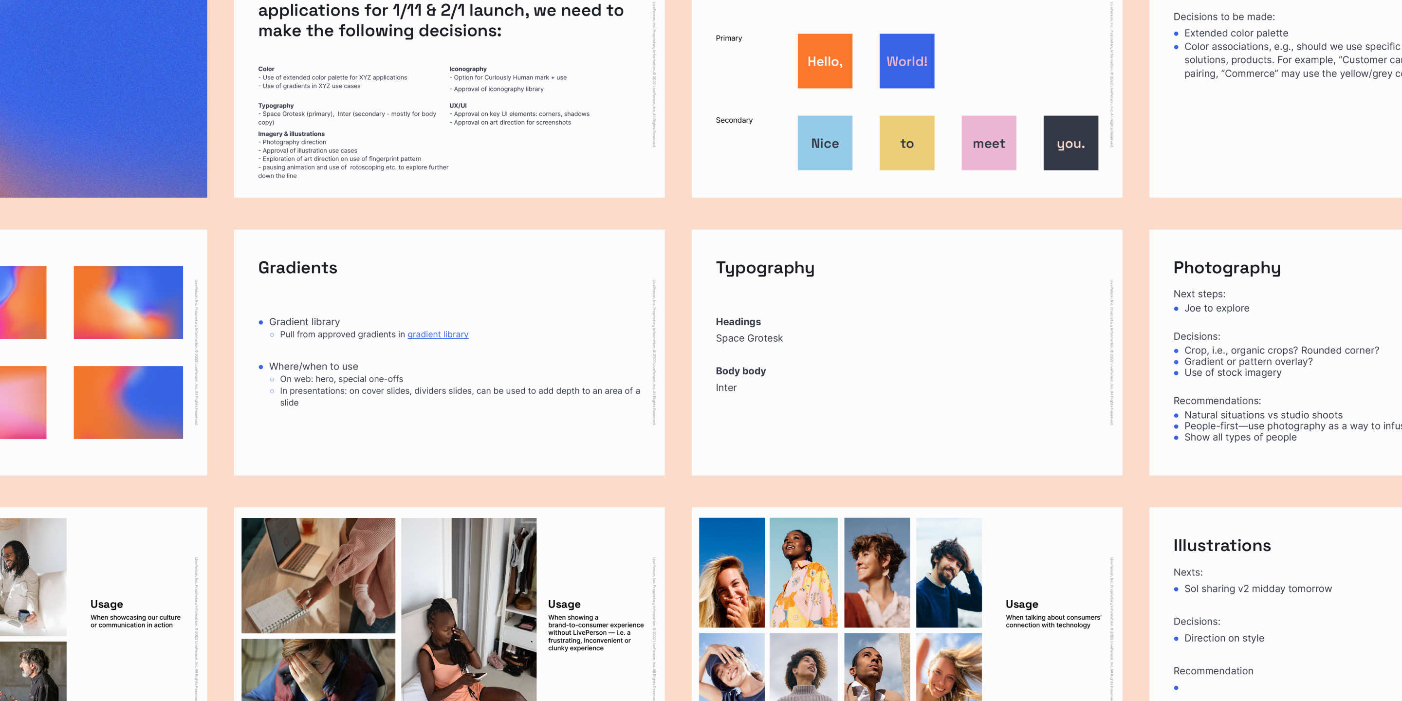
Reviewing LivePerson's recent rebrand
LivePerson's rebrand included new positioning and visual assets. Evaluating these brand elements from a web and systems perspective would help inform potential directions for the site's usability, look and feel, and verbal communication of their purpose.
Crafting personalized, human-like interactions at scale, delivering tailored solutions that resonate with each individual customer, enriching experiences and building lasting relationships.
Brand purpose

Research
Gathering site inspiration from industry leaders
To better identify needs, wants, and niceties, I explored sites with similar assets, brand messaging, and product offerings to understand how LivePerson's site could fit within industry standards while exhibiting exceptionality and distinctiveness.
Things we noticed
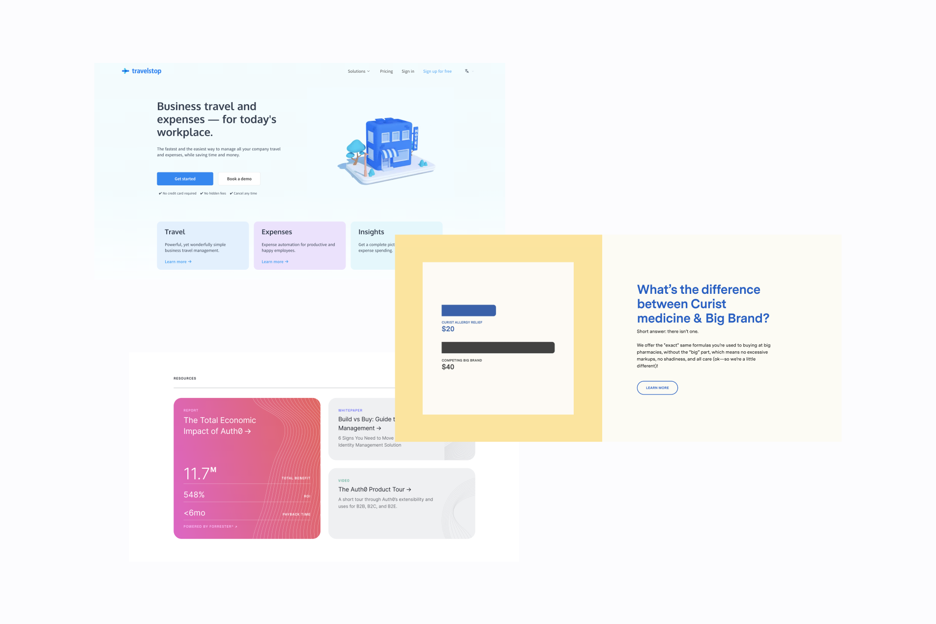
Branded moments
- Leveraging gradients or patterns to add emphasis
- Highlighting important content with color or intentional sectioning
auth0 / checkout.com / kion
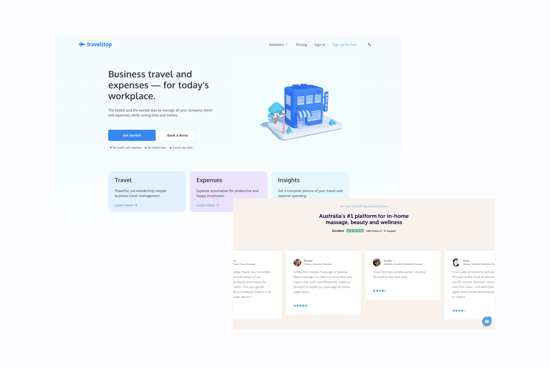
Light UI
- Balancing neutral & secondary colors
- Creating visually interesting compositions & layouts
Travelstop / Curist / auth0
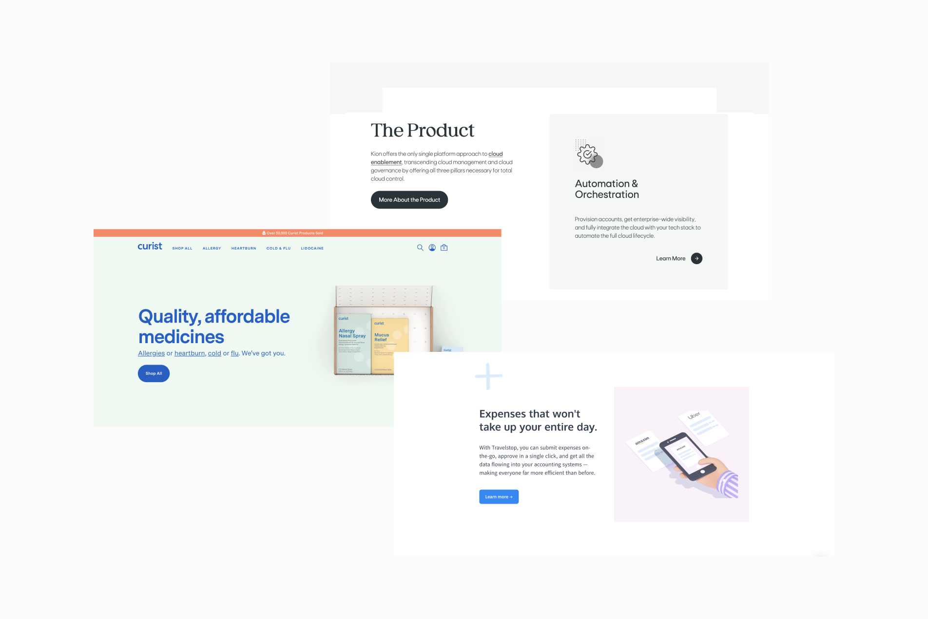
Imagery & graphics
- Combining photography, illustration, and iconography
- Imagery creates more opportunity to bring in color
kion / Curist / Travelstop
Analysis
Defining next steps & opportunities
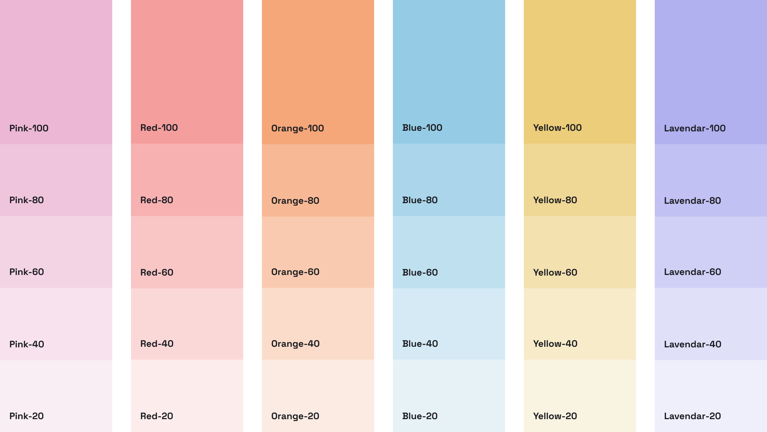
Establishing an extended color palette & associations
Allowing more flexibility for accessible color usage across digital platforms
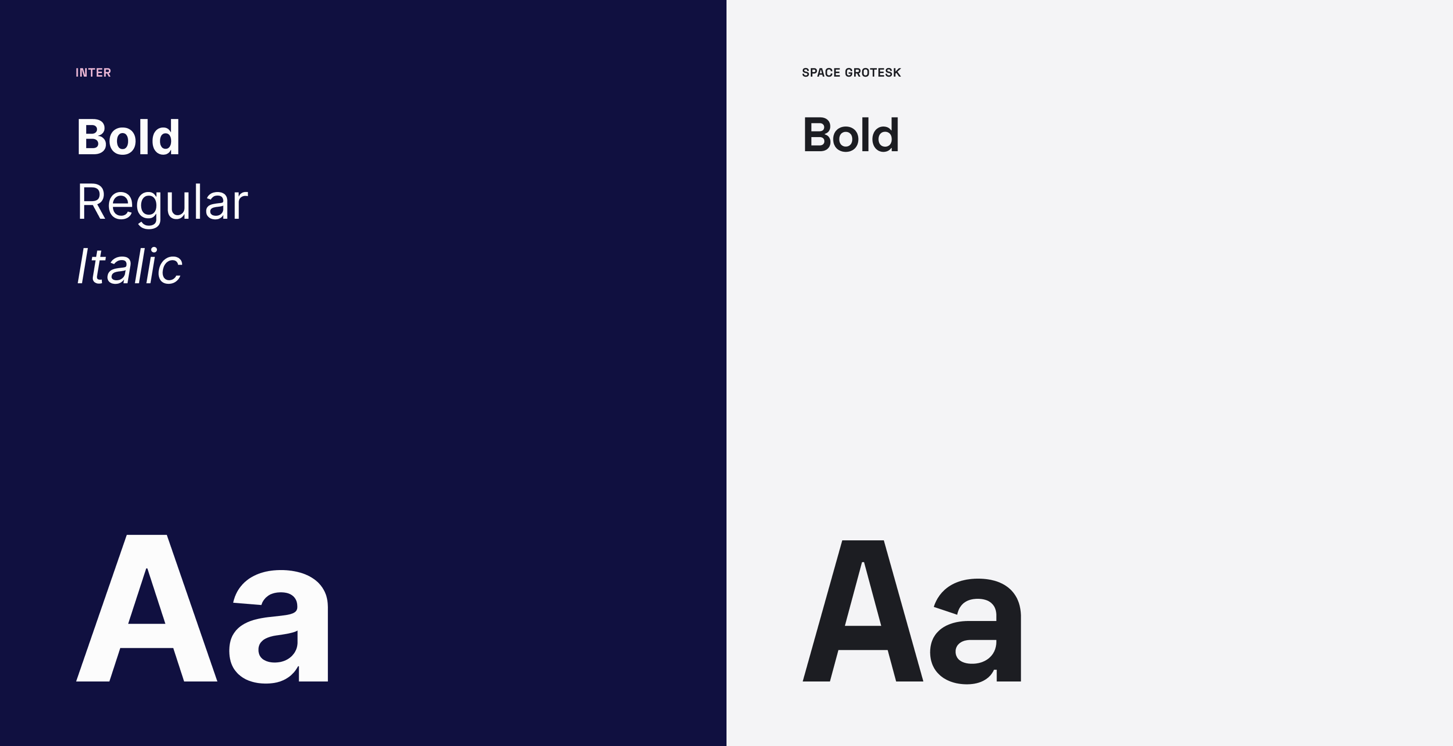
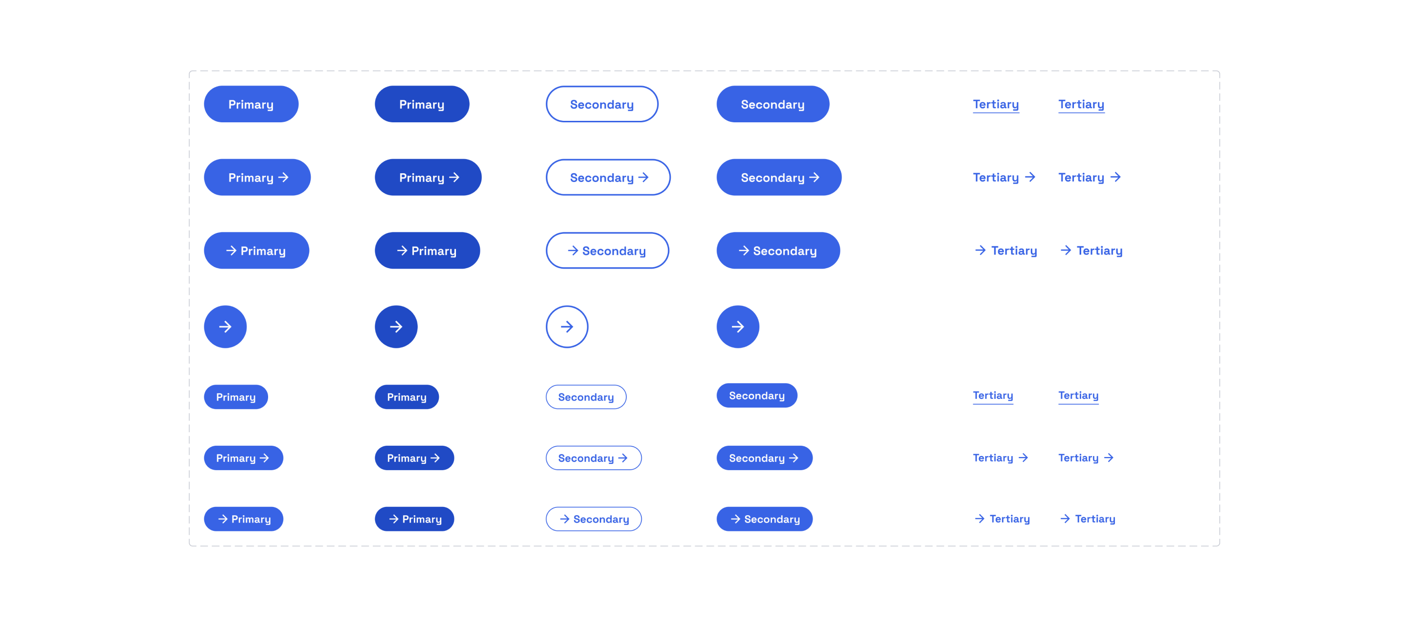
Stylizing UI elements, images & graphic assets
Adding touches of rounded corners and dropshadows with imagery
Branding succinct content with a unique tone of voice
Constructing informational pieces of copy that also convey relevance & approachability
Design
Creating an empathetic user experience
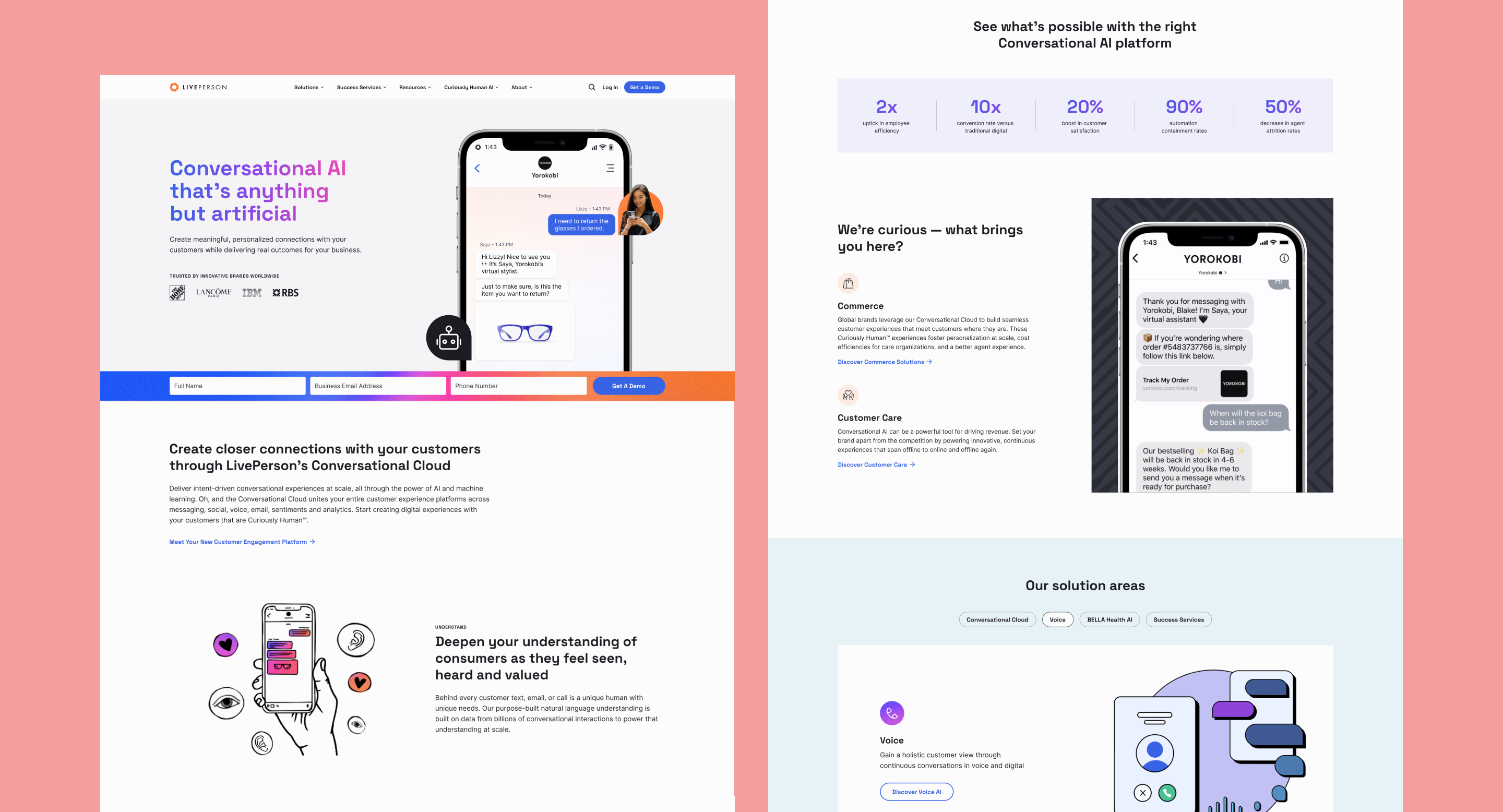
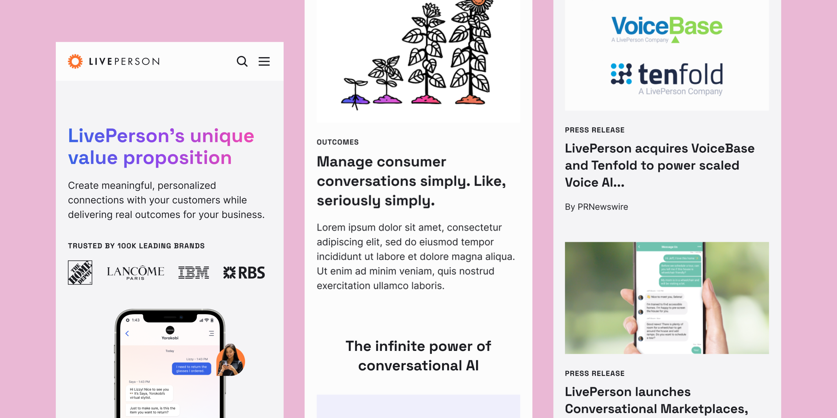
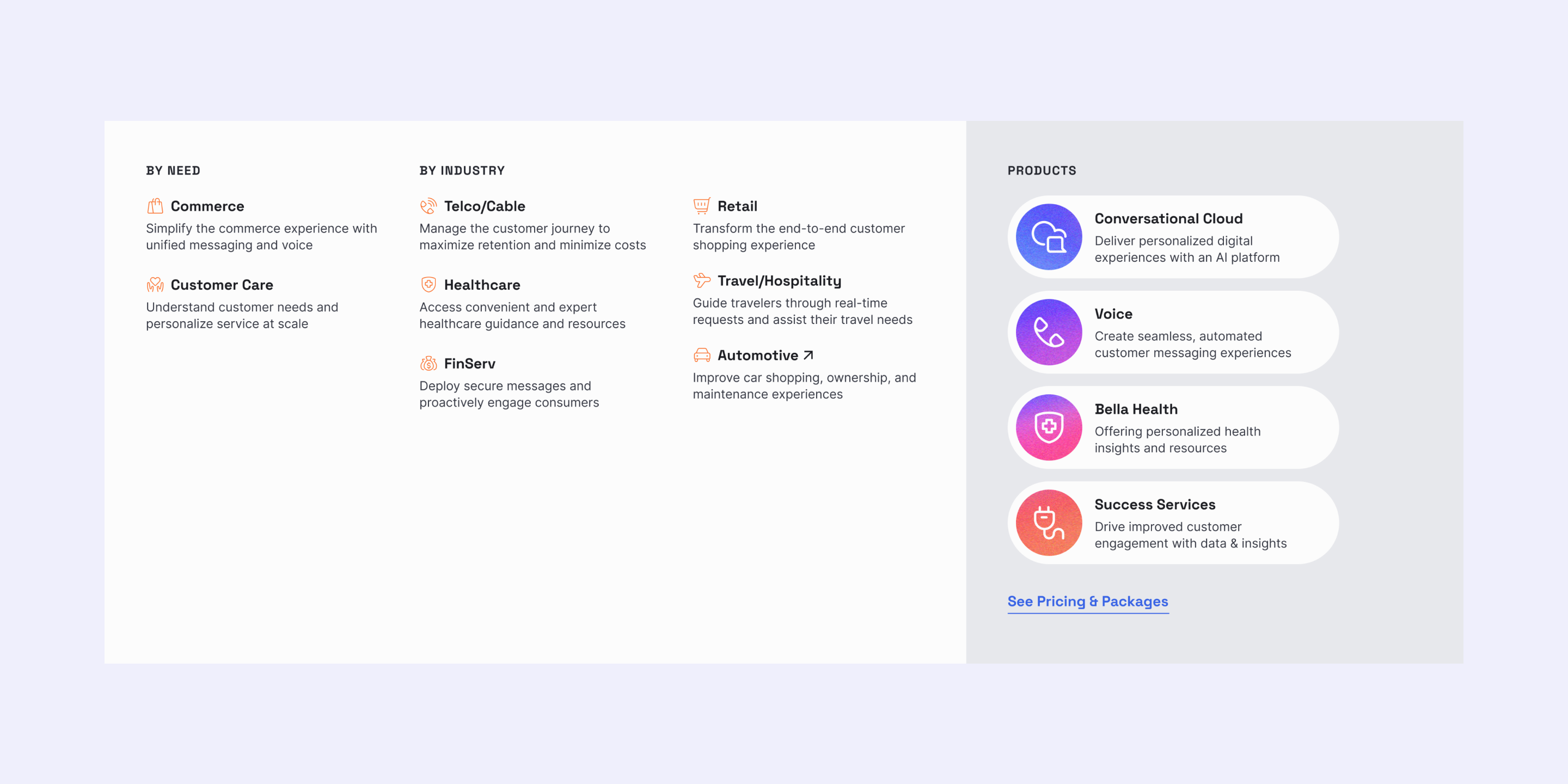
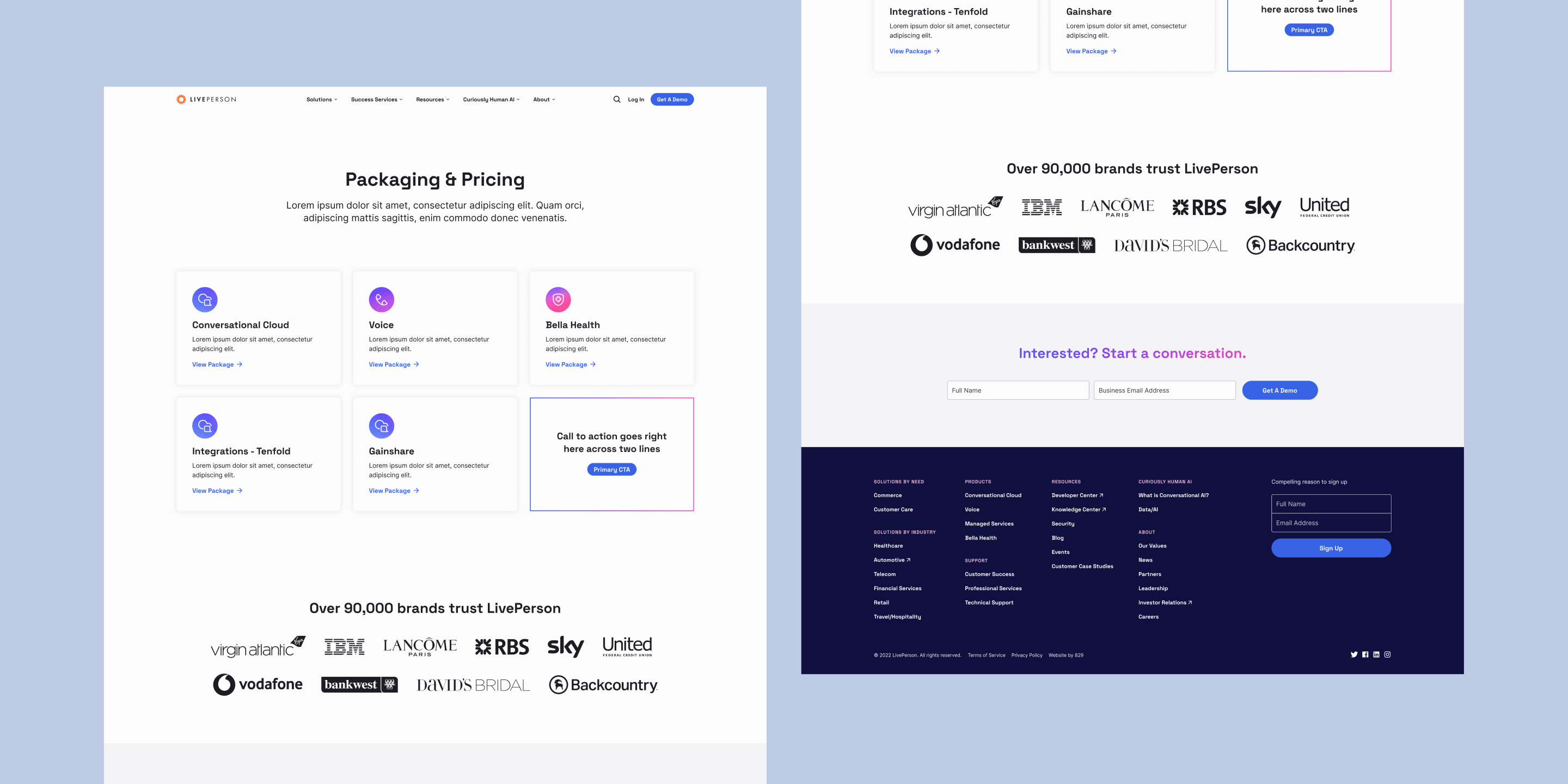
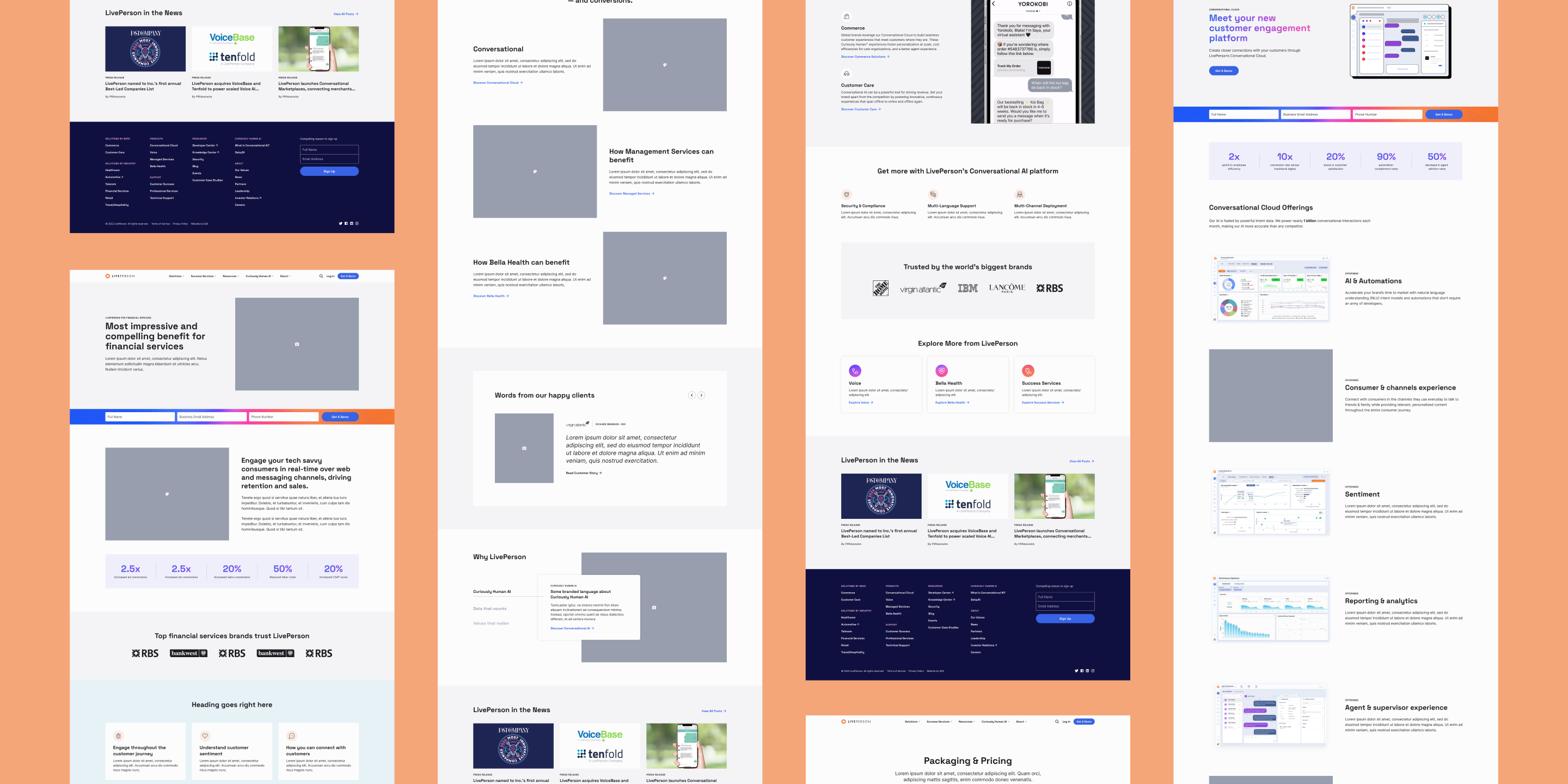
LivePerson's website highlights innovative technologies, empowering businesses to engage with customers through messaging. Users are highly encouraged to explore product offerings and insightful resources along the way, ensuring a simple user experience through intuitive navigation, pleasing visuals, and guided content.
Design
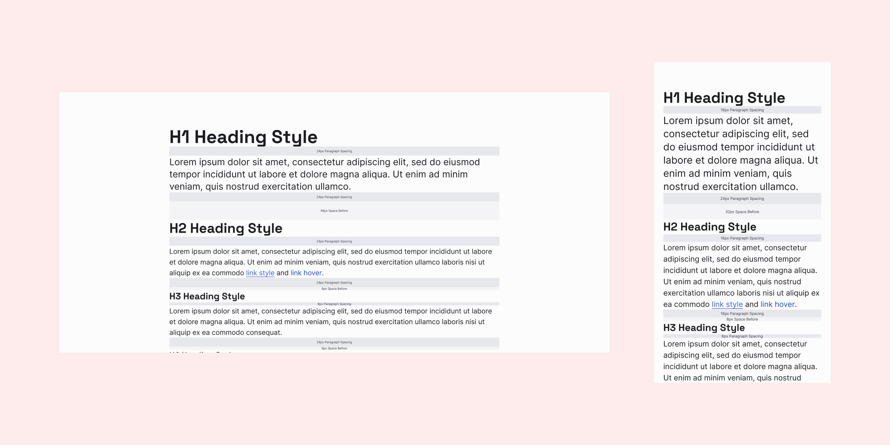
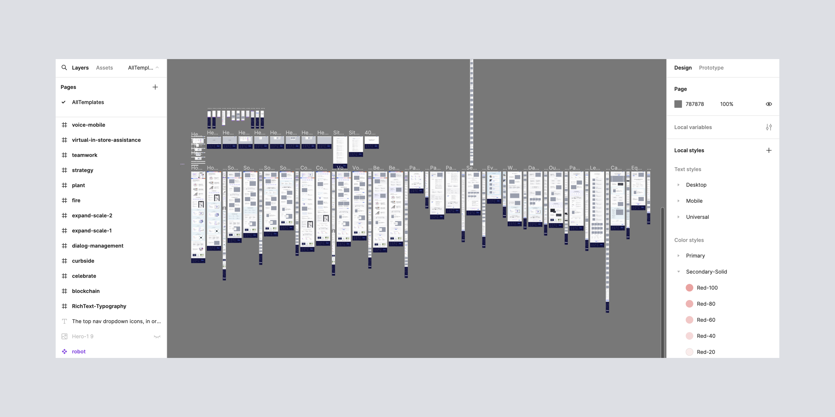
Handing off an all-inclusive design system
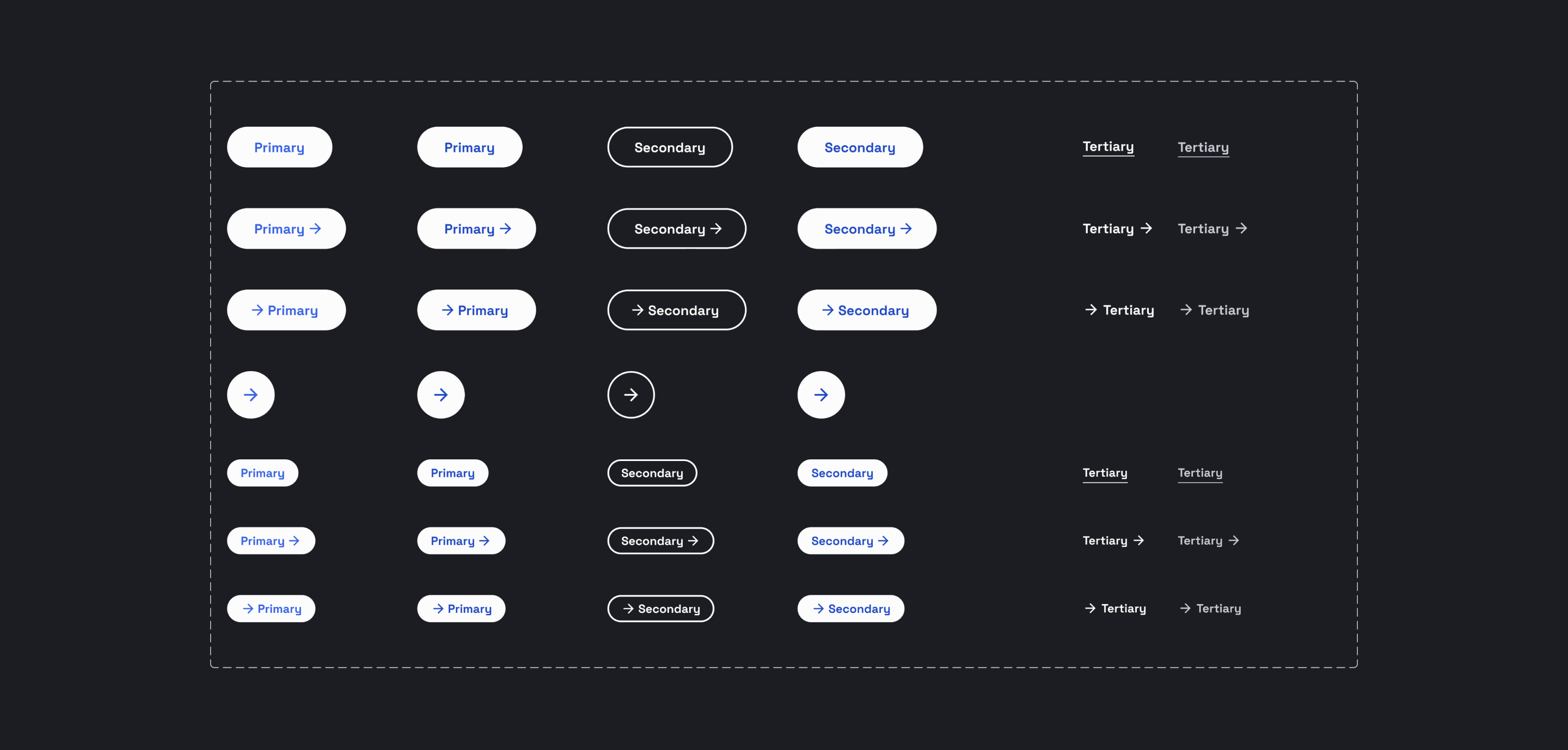
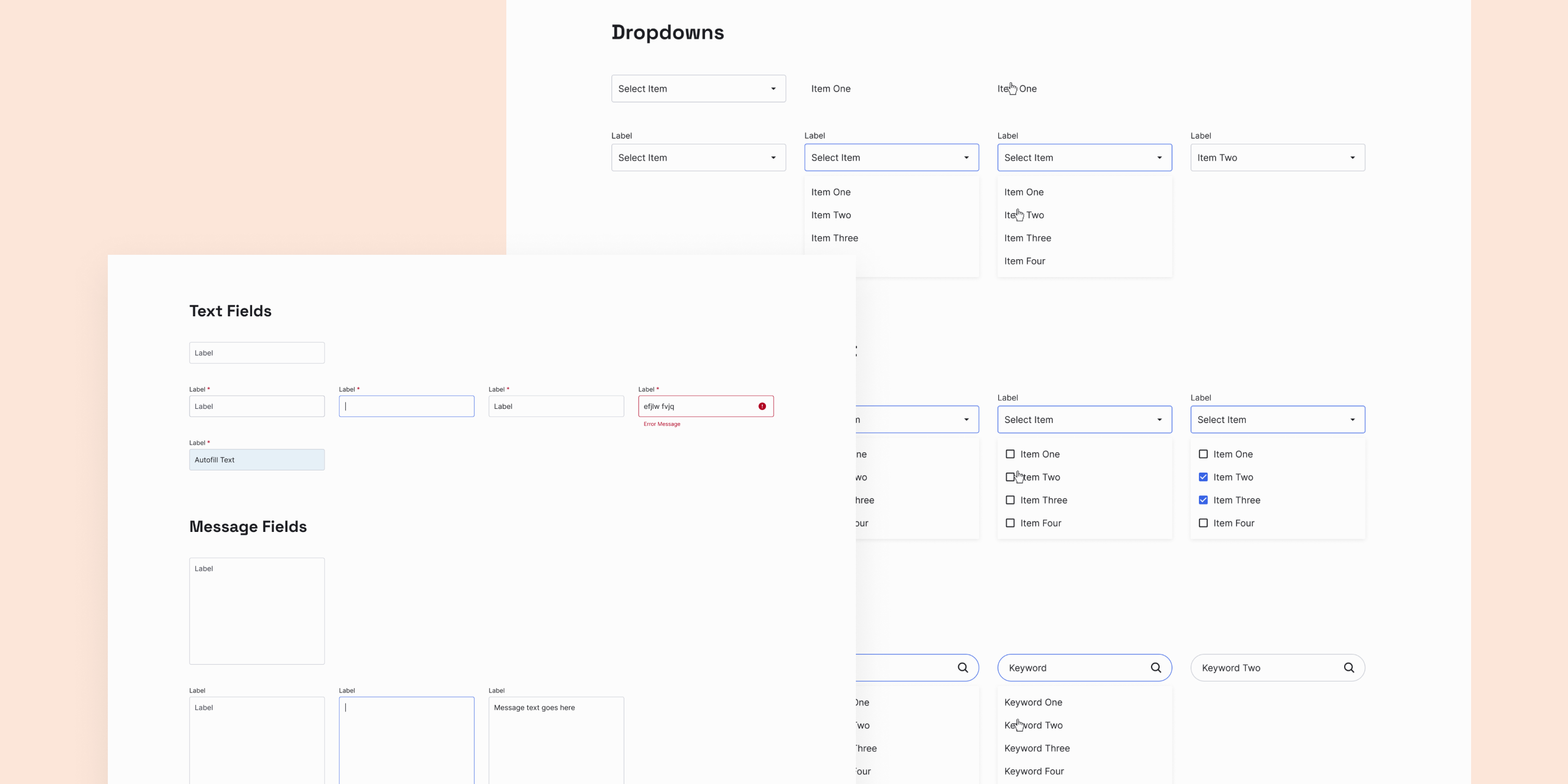
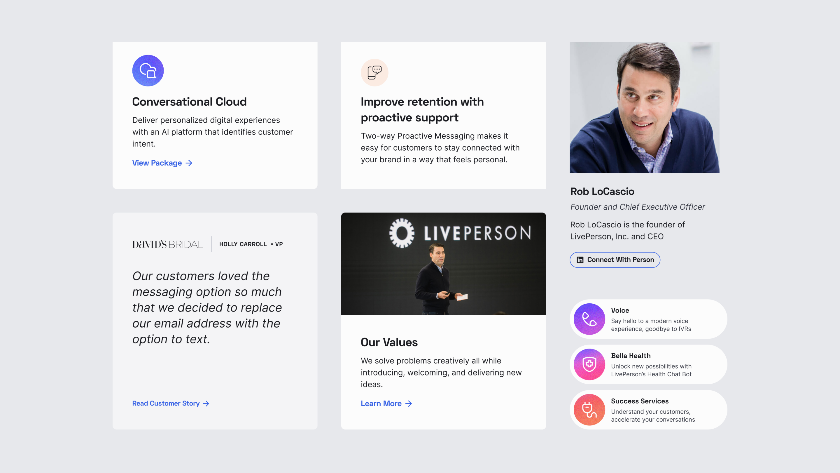
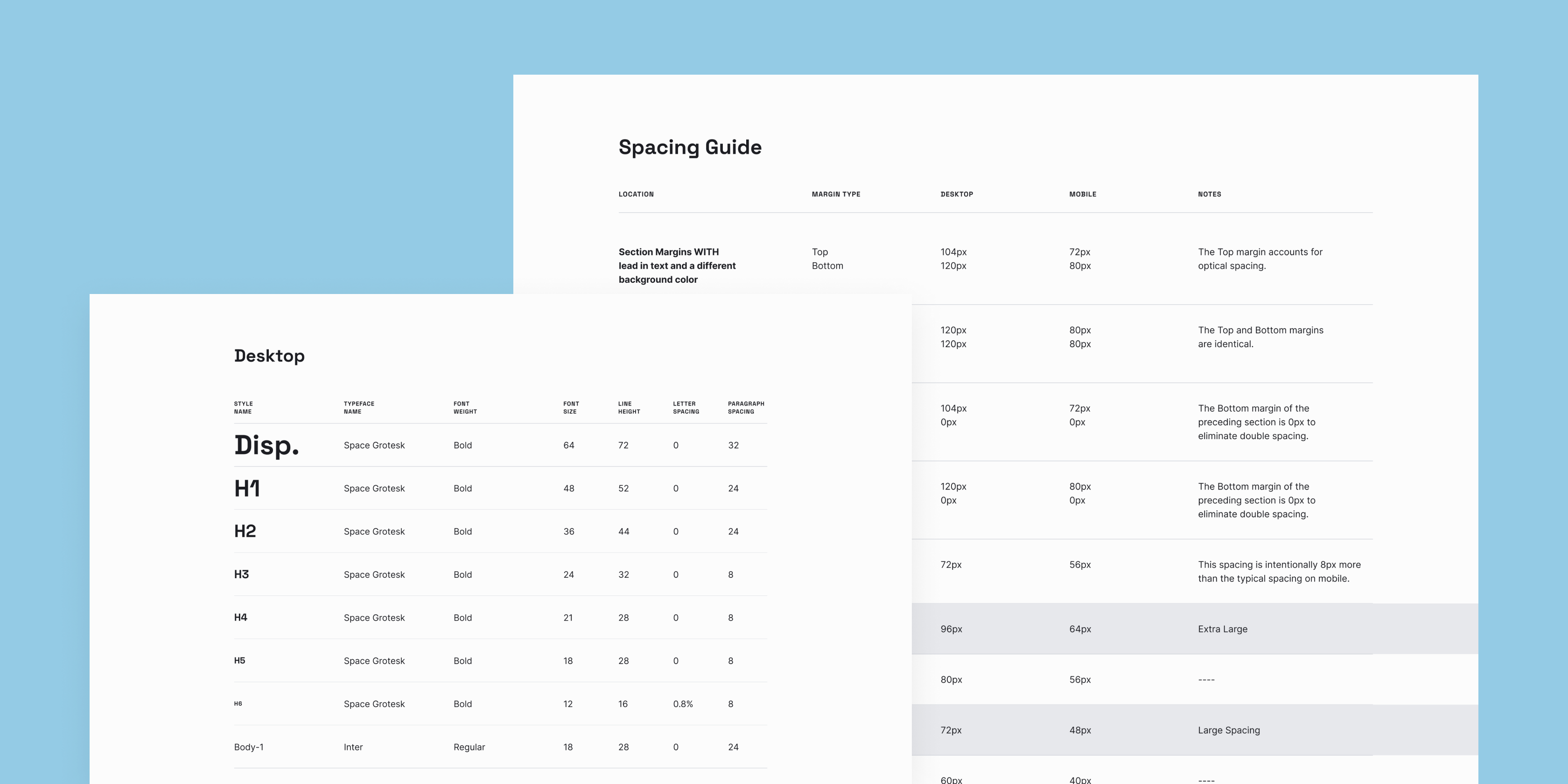
LivePerson requested a packaged design system inclusive of foundational, flexibly-built components. Inspired by various atomic-based design systems published on the web, LivePerson's aims to serve as a toolkit that would be enhanced further to reflect evolving business needs and company growth. We worked with SEO experts, marketers, UX strategists, designers, and engineers to ensure we were setting the system up for success.
