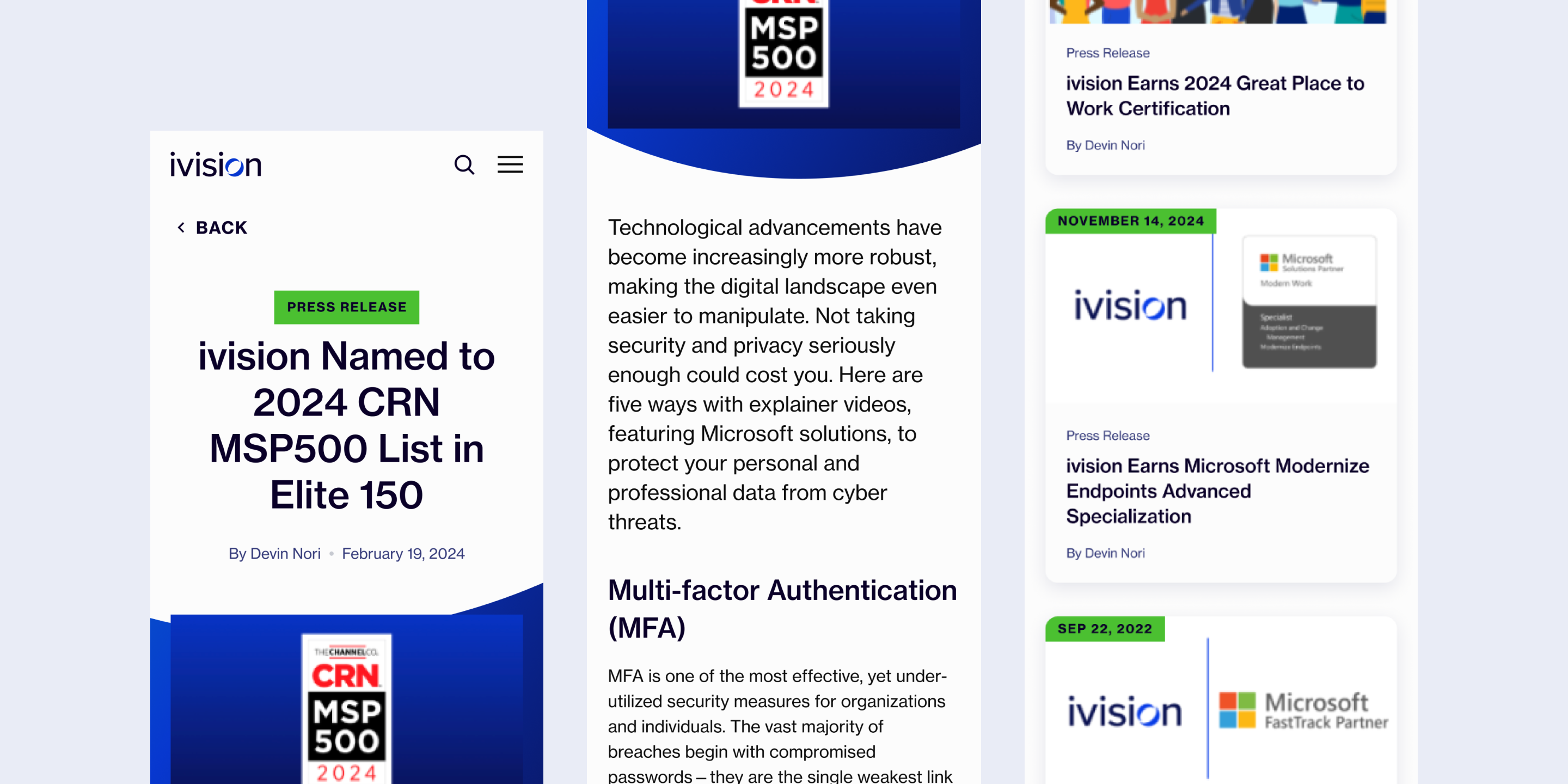
ivision —
Ushering in a new era of innovative solutions and enhanced experiences for valued partners and stakeholders

Project Overview
ivision is a technology consultancy and outsourcing firm engineers success for clients through objective recommendations, process, and expertise. My challenge involved transforming a modernized identity and online presence that resonates with their objectives.
Solutions

Creating a fresh brand image to reflect dedication and service offerings
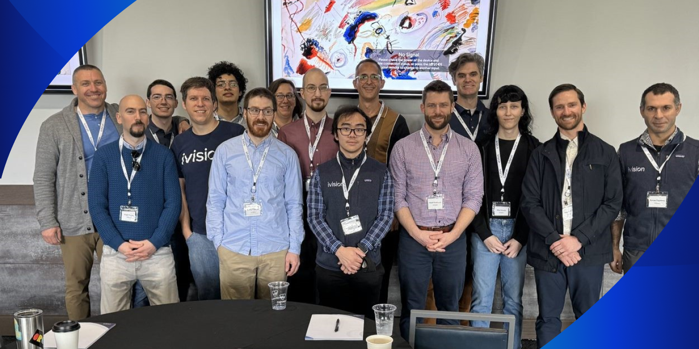
Forefronting the talent and effort behind ivision's various workstreams
Branding
Moving ever-forward with ivision's end-to-end services
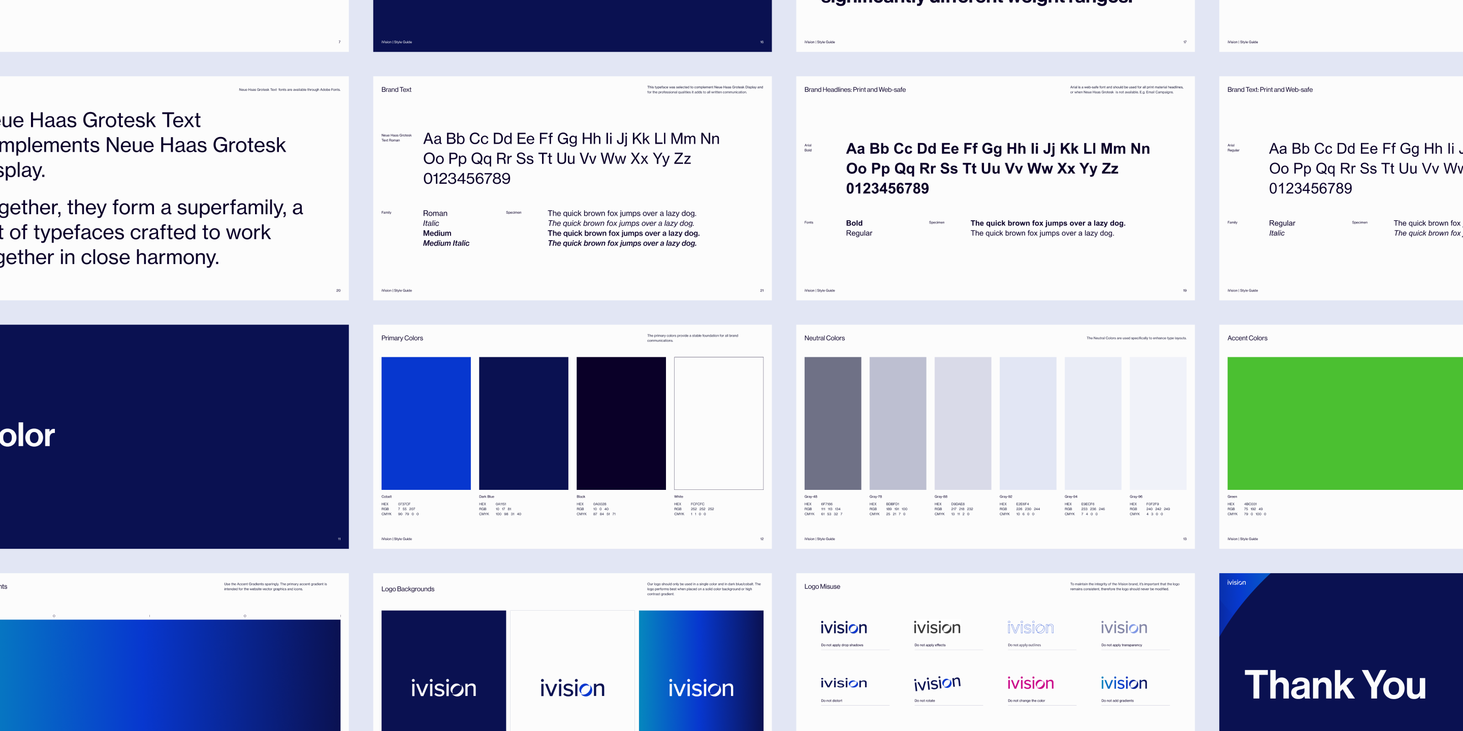
I collaborated with ivision's CEO and key stakeholders through three rounds of logo iteration and feedback. A full visual identity was built systematically around the logo to extend into all branches of the company.
Research
Auditing the current brand
Stakeholder interviews were conducted. Questions regarding target audiences, values, and initiatives helped form a holistic understanding and define what our team had to work off of.
Earn clients for life by providing
innovative solutions with exceptional customer service
Our brand purpose
Customer-centric
Putting the needs and goals of customers at the forefront, striving to deliver exceptional service, tailored solutions, and meaningful partnerships to ensure client success and satisfaction
World-class
Pursuing excellence in everything it does, maintaining a relentless focus on quality, professionalism, and continuous improvement to deliver superior outcomes
Collaborative
Fostering a culture of collaboration, teamwork, and knowledge-sharing to exceeding customer expectations
Innovative
Committed to pushing the boundaries of technology and offering solutions that drive progress and empower businesses
Community-driven
Actively engaging with and supporting local communities through philanthropic initiatives, volunteerism, and environmental stewardship
Research
Gauging visual interest
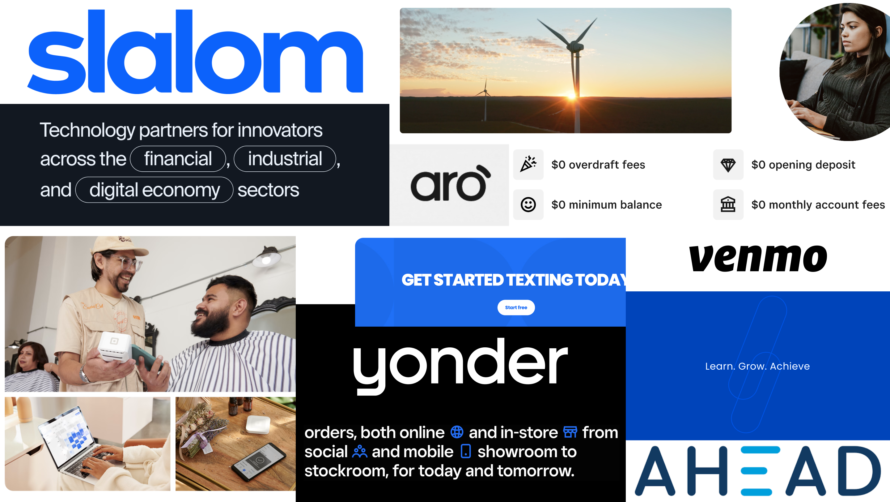
Key stakeholders were presented with stylescapes to guide potential visual direction for the new logo.
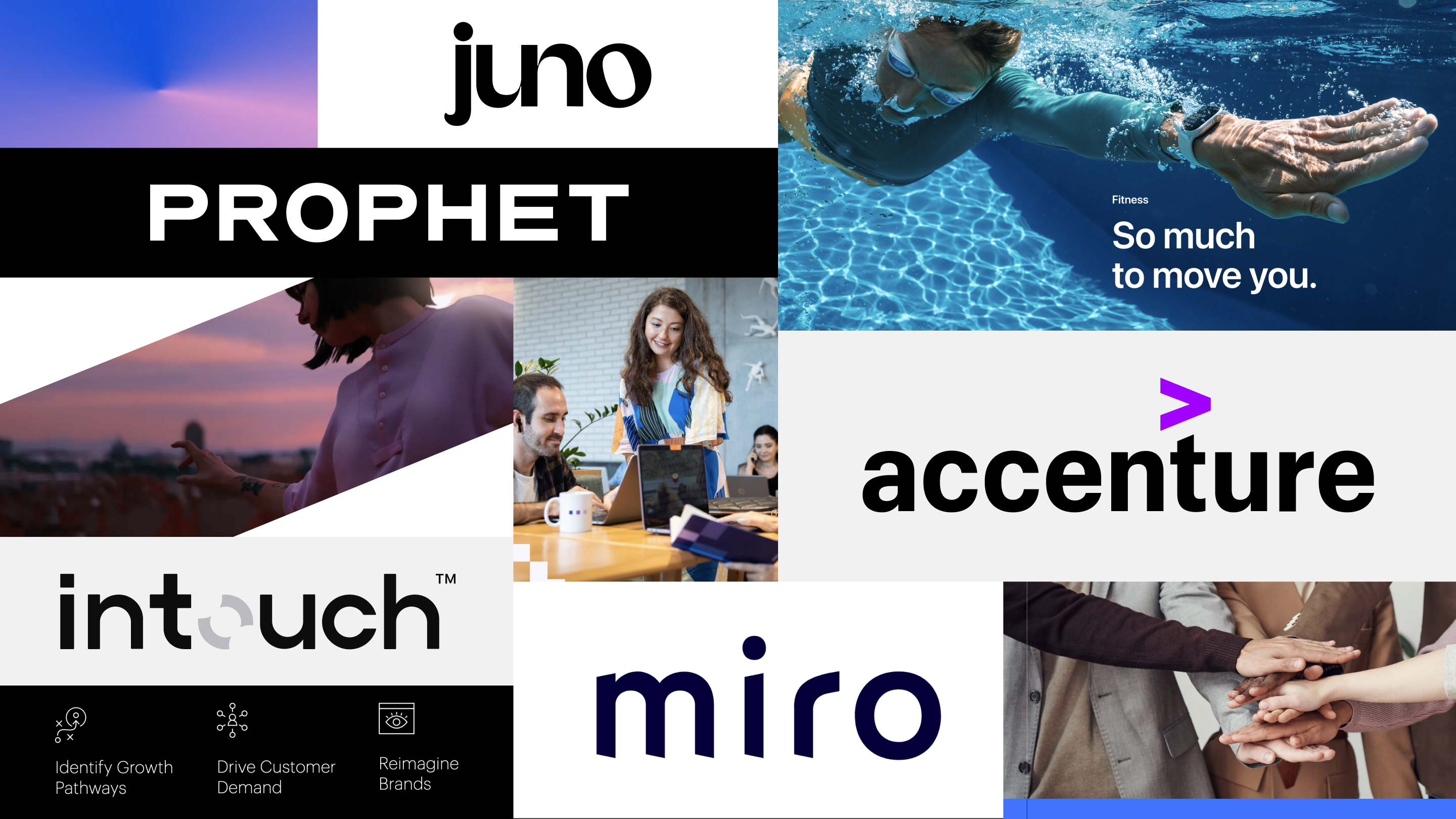
01 // Sleek modern
Capturing the feeling of connectedness and partnership through the use of interwoven, abstract geometry. Its minimalism gives this direction a timeless confidence.
Feedback
∙ Likes the cleanliness of a wordmark
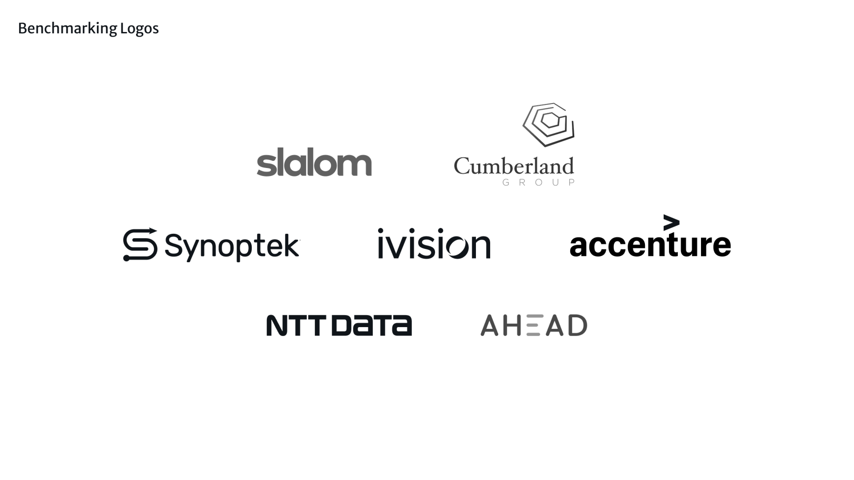
∙ Likes Accenture's symbol and color usage
∙ Dislikes all-caps
02 // Dynamic humanist
Conveying sophistication within simplicity through arrangements of bold forms and color. The visual weight of elements gives this direction a sense of trust and welcomeness.
Feedback
∙ Likes Ahead's logo and interesting letter treatment
∙ Dislikes too-rounded elements, feels juvenile
∙ Dislikes too much color in the logo, color needs to be intentional
Iteration
Ideating on initial concepts
Aspects from stylescapes were taken into consideration when sketching out initial logo concepts. The simplicity of a wordmark combined with a modern, clean symbol seemed to be the most appropriate direction for ivision.
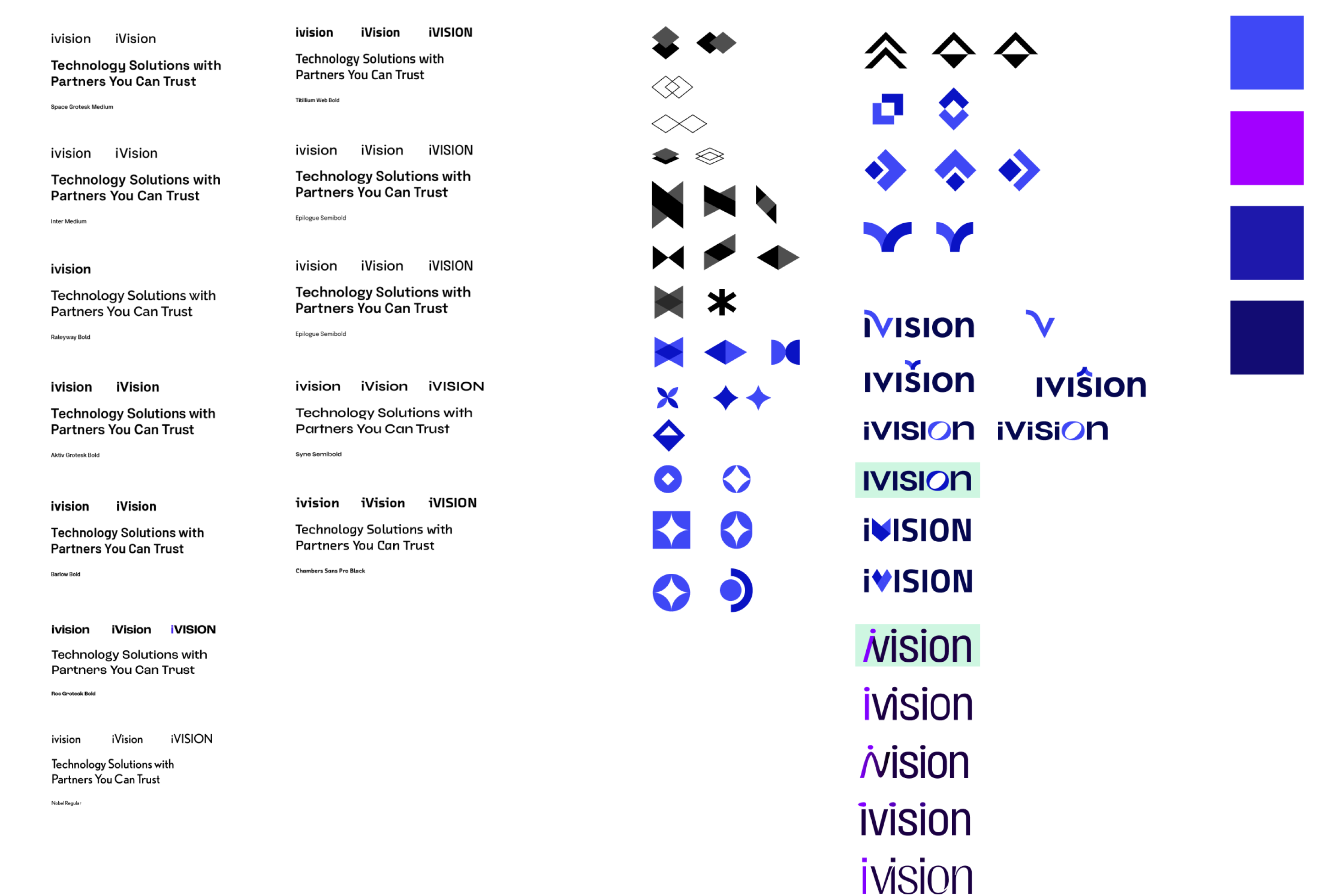

First three concepts
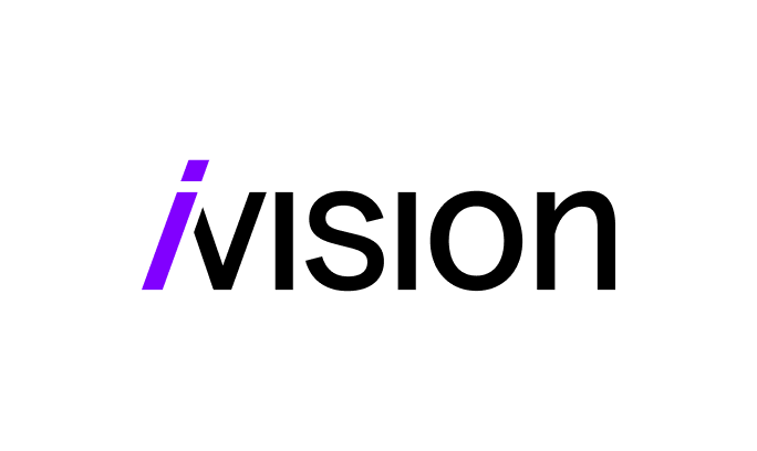
Concept 01
A dynamic, forward-leaning stroke suggests the company's constant progress
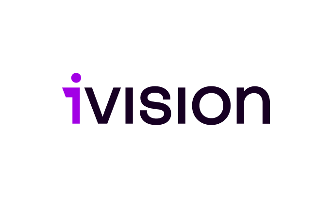
Concept 02
A bespoke symbol gives the wordmark a sense of individualism and character
✦ Concept 03
The current logo's elliptical mark is evolved and integrated within the wordmark to portray a sense of cyclicality
Concept 03 // Feedback for next round iterations
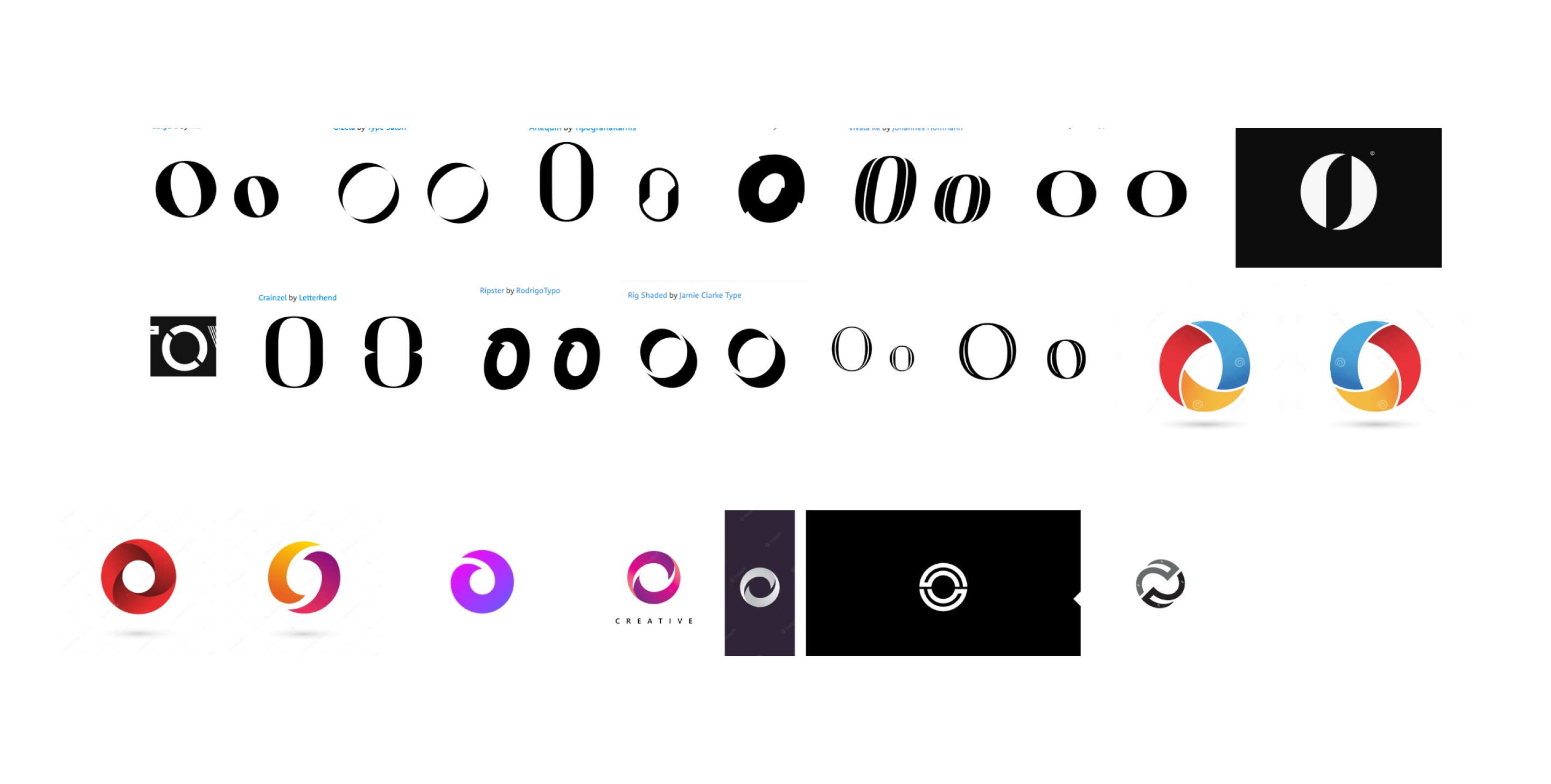
Push ellipse symbol
How can the ellipse feel more like an impactful symbol that can be used independent of the wordmark?
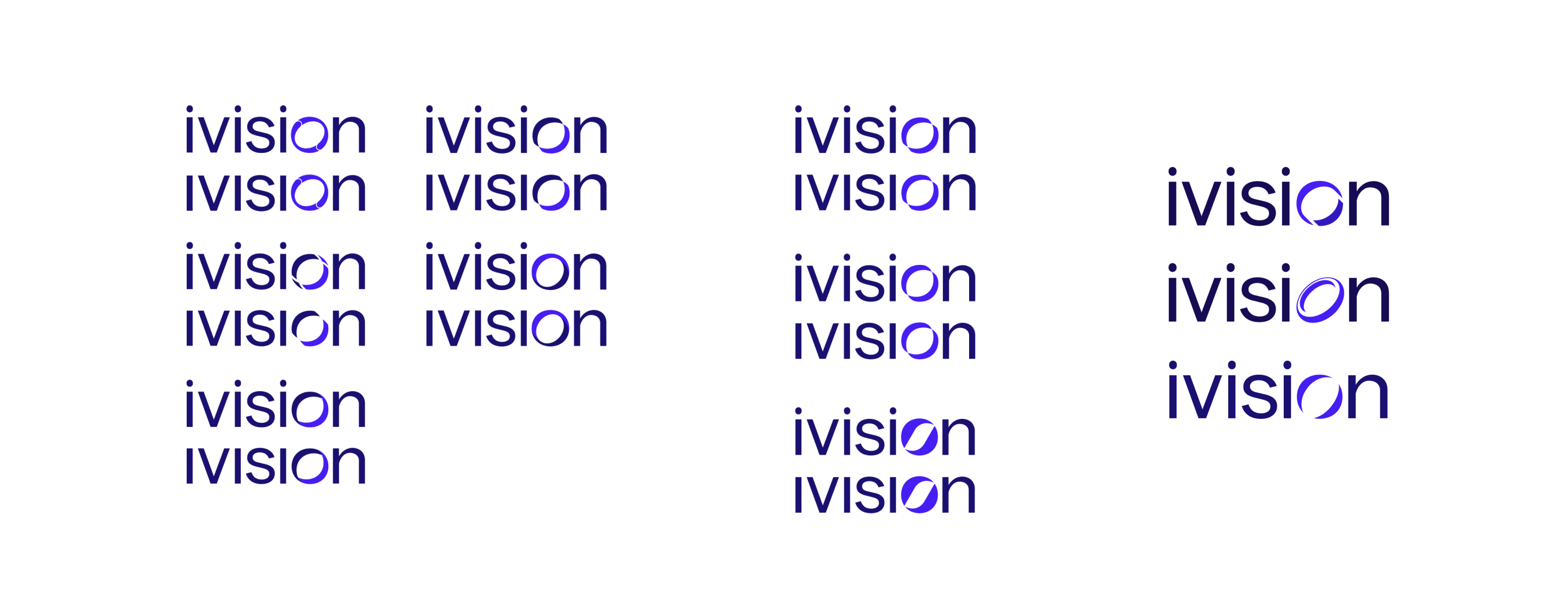
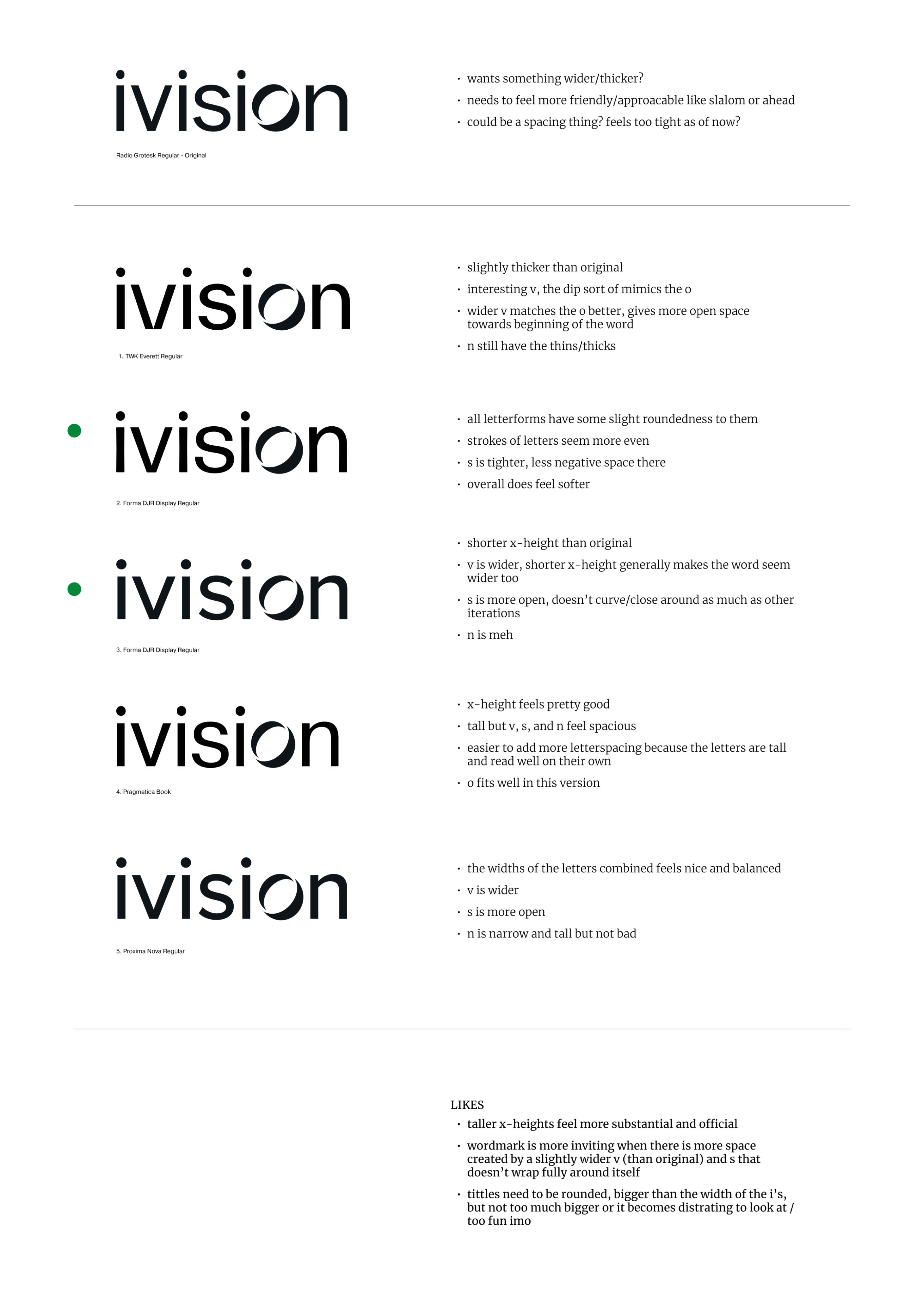
Explore typefaces
How can different typefaces balance with the ellipse and color?
Explore accent colors
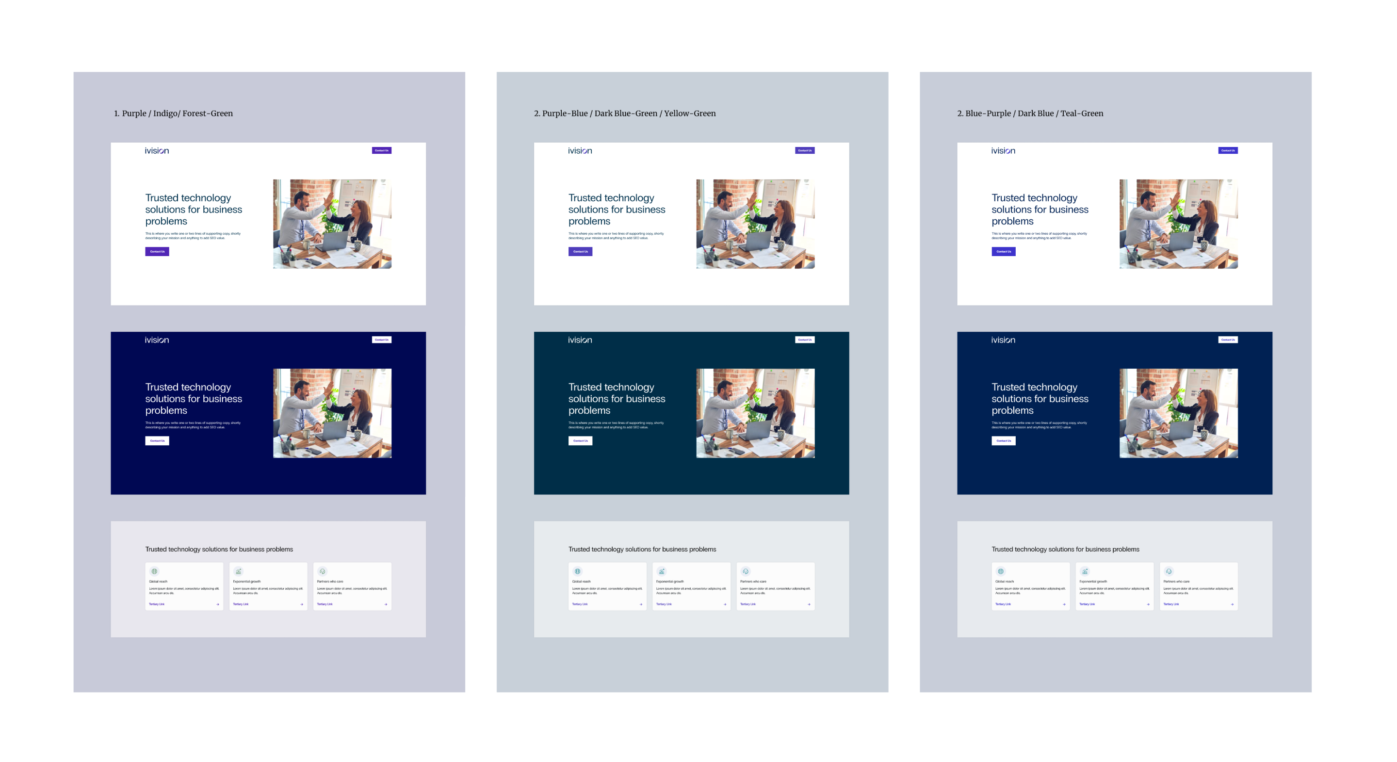
What primary and accent colors work well within the logo and the identity?
Iteration
Tweaking minute details
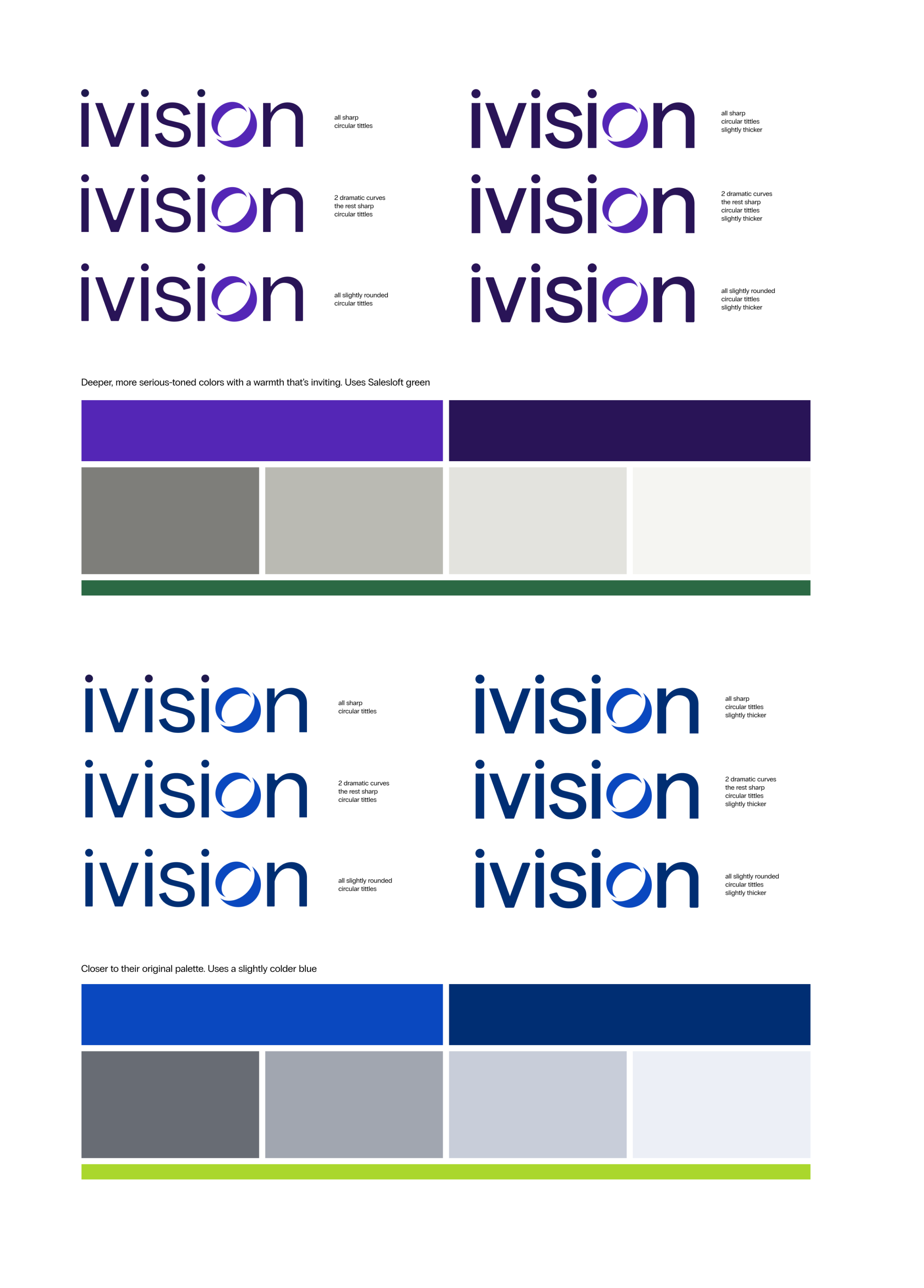
Getting the logo right meant testing more combinations of the aforementioned feedback. It was down to adjusting and comparing slight differences to refine the logo.


Introducing ivision's new brand identity
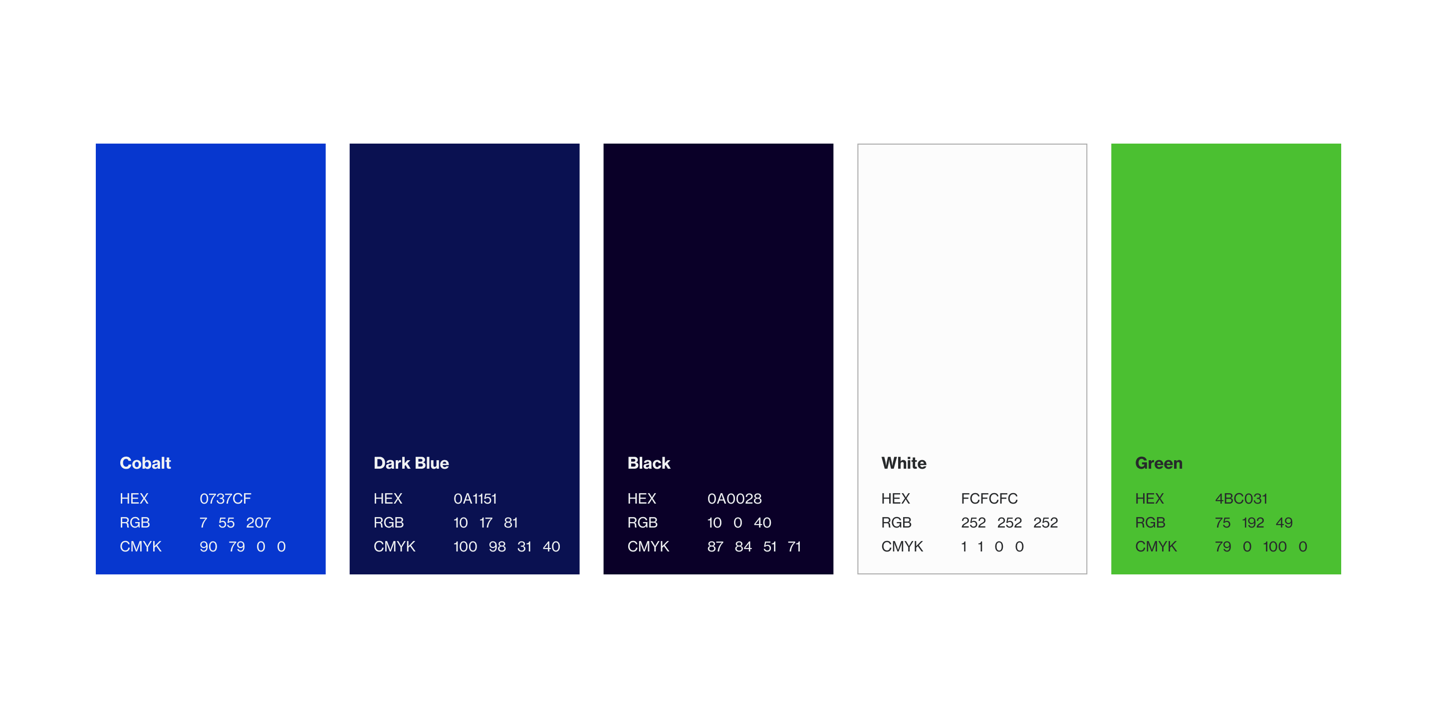
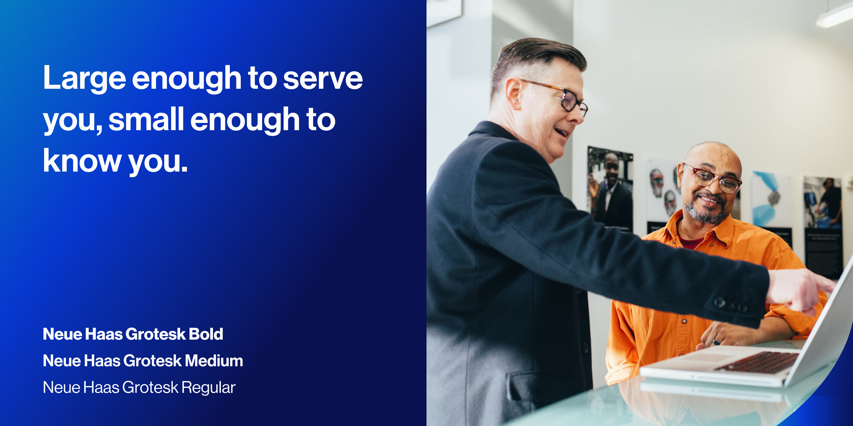
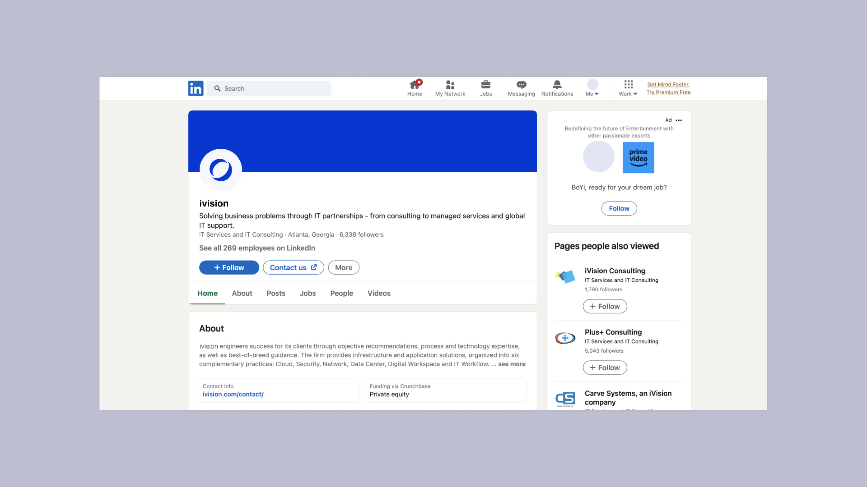
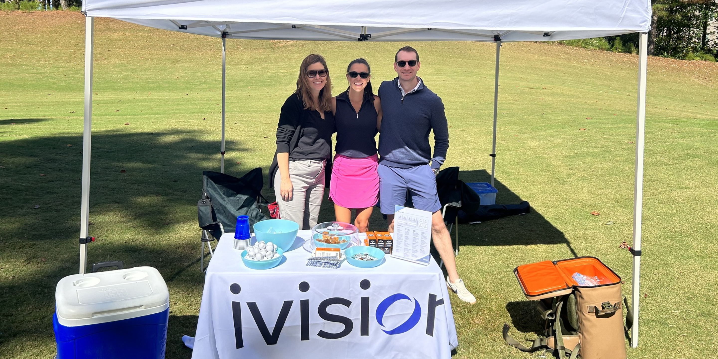
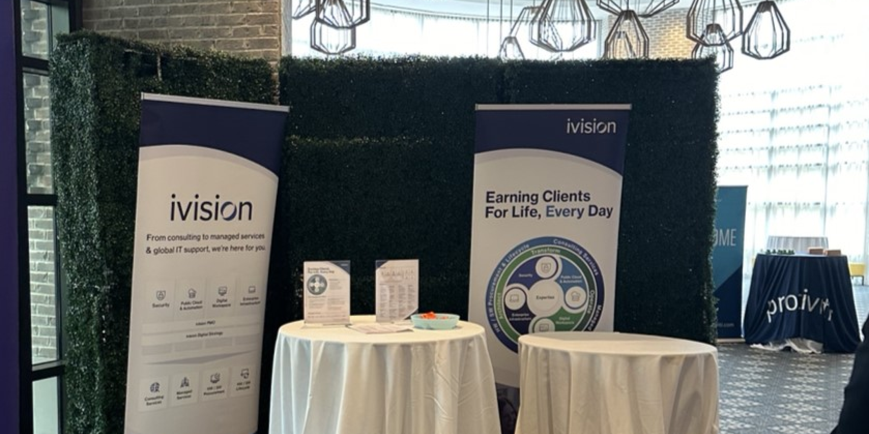
The new ivision logo and identity expresses your brand and organization's ability to fully partner with clients across their full lifecycle.
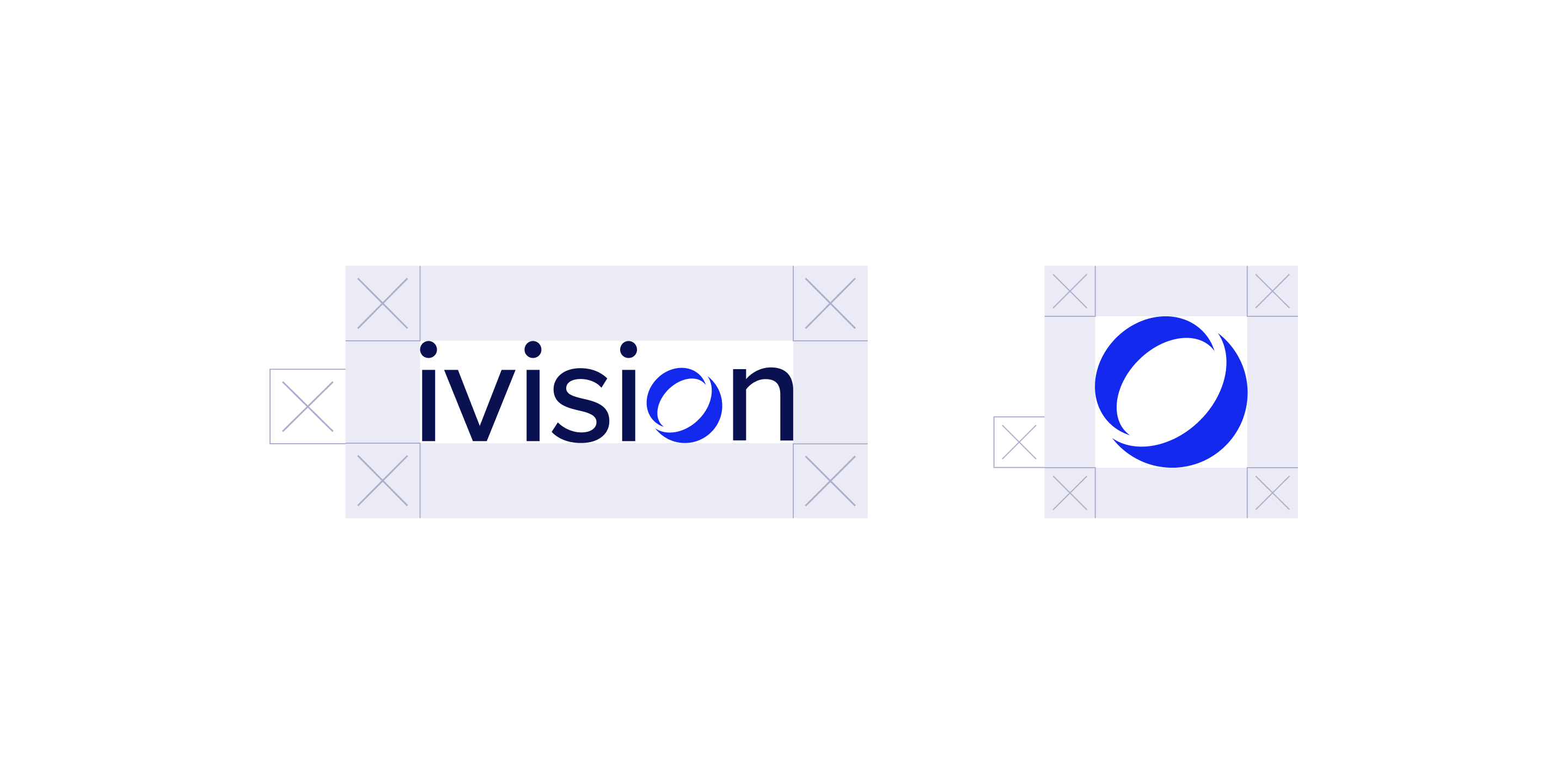
It dramatically evolves and refreshes the existing use of the ellipse in a way that communicates clarity, structure, and forward motion for the future.


Website design
Fully partnering with clients across the whole life cycle
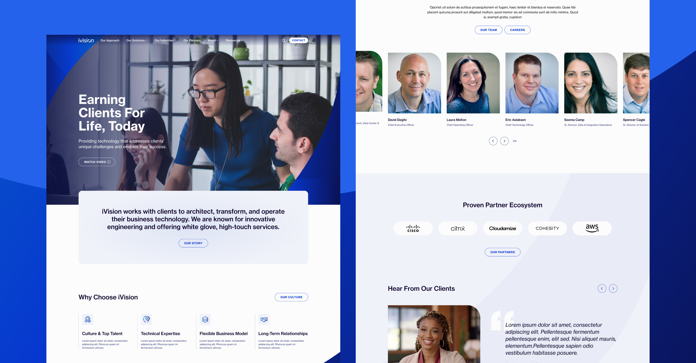
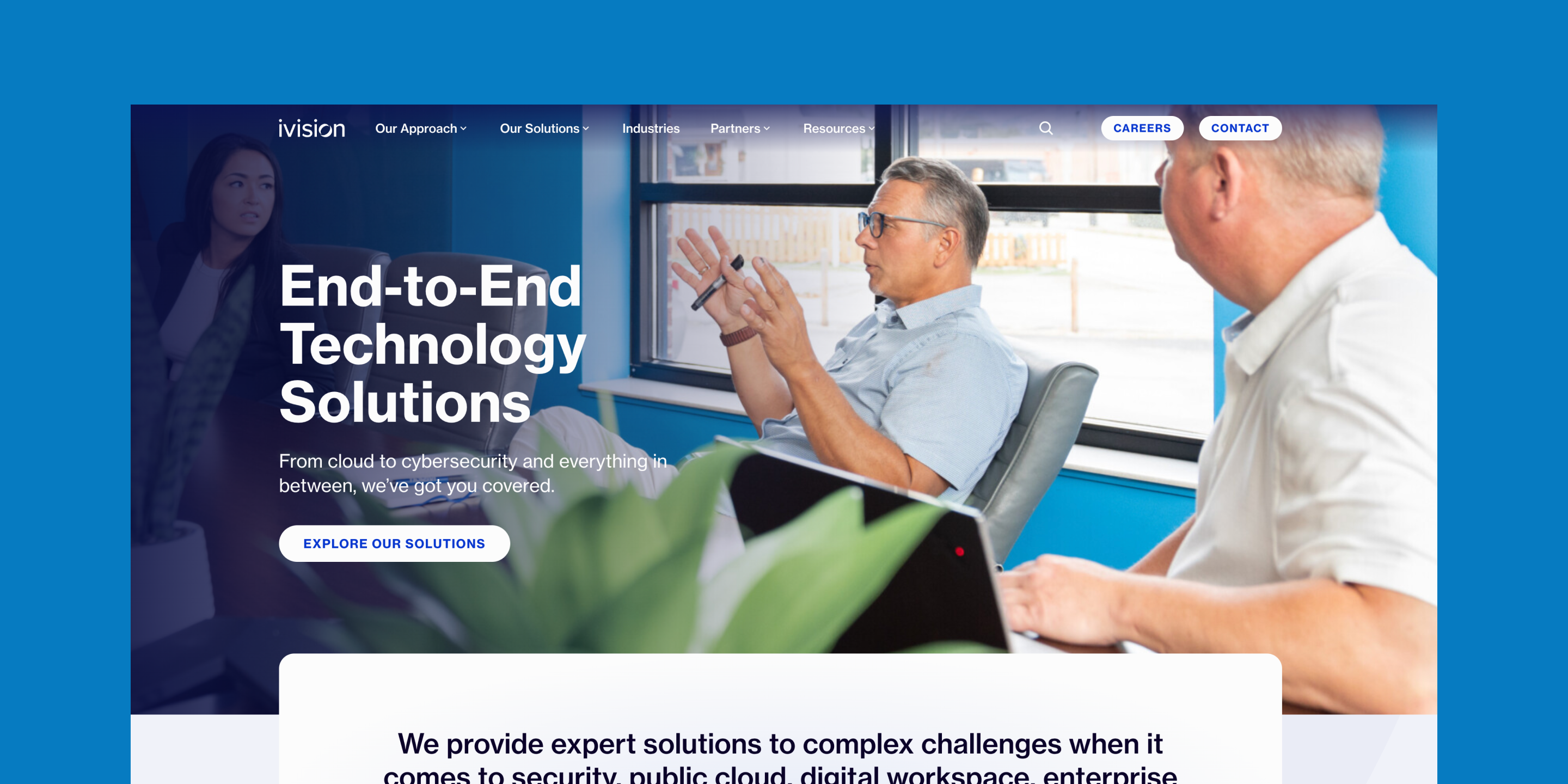
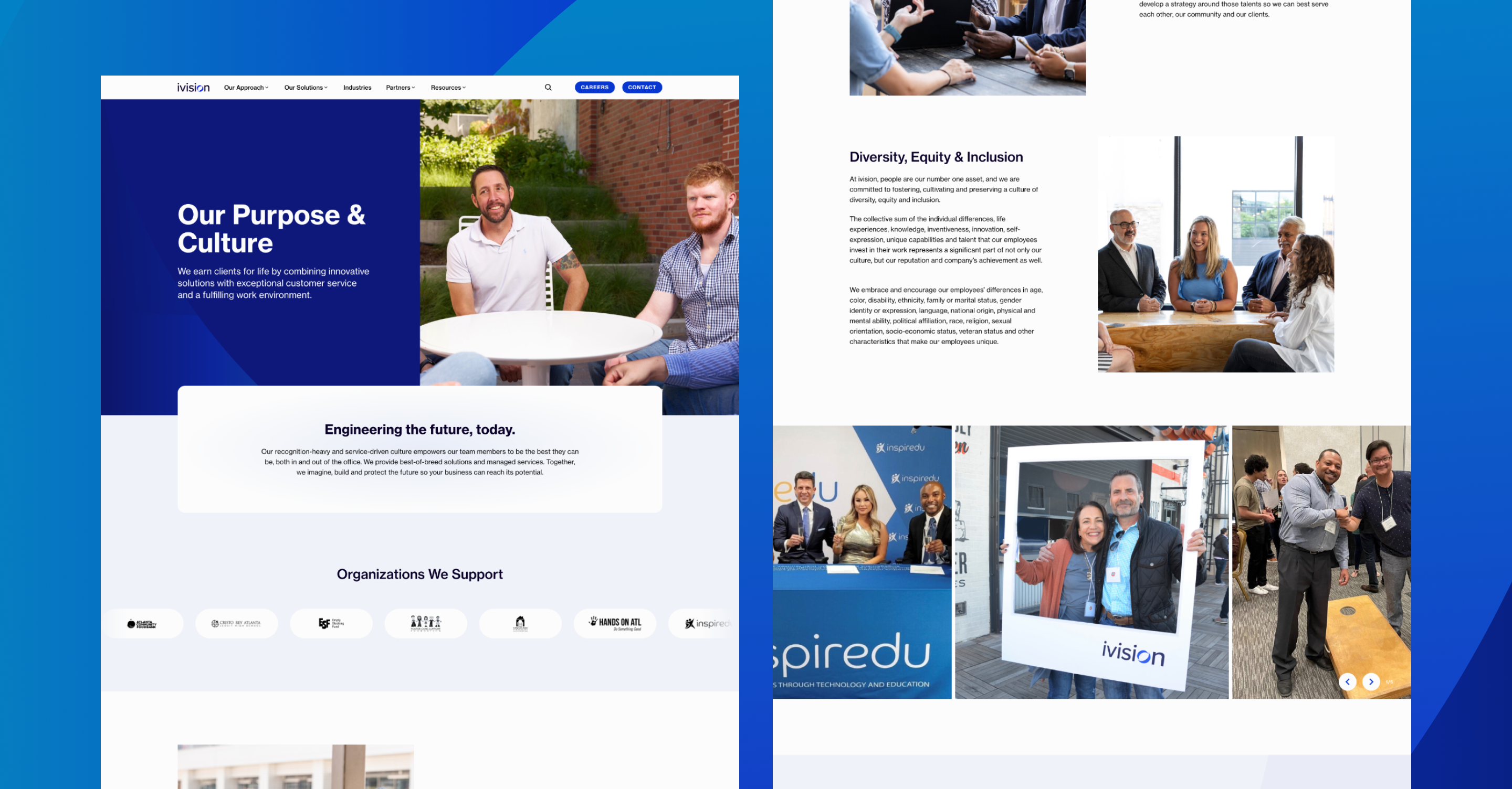
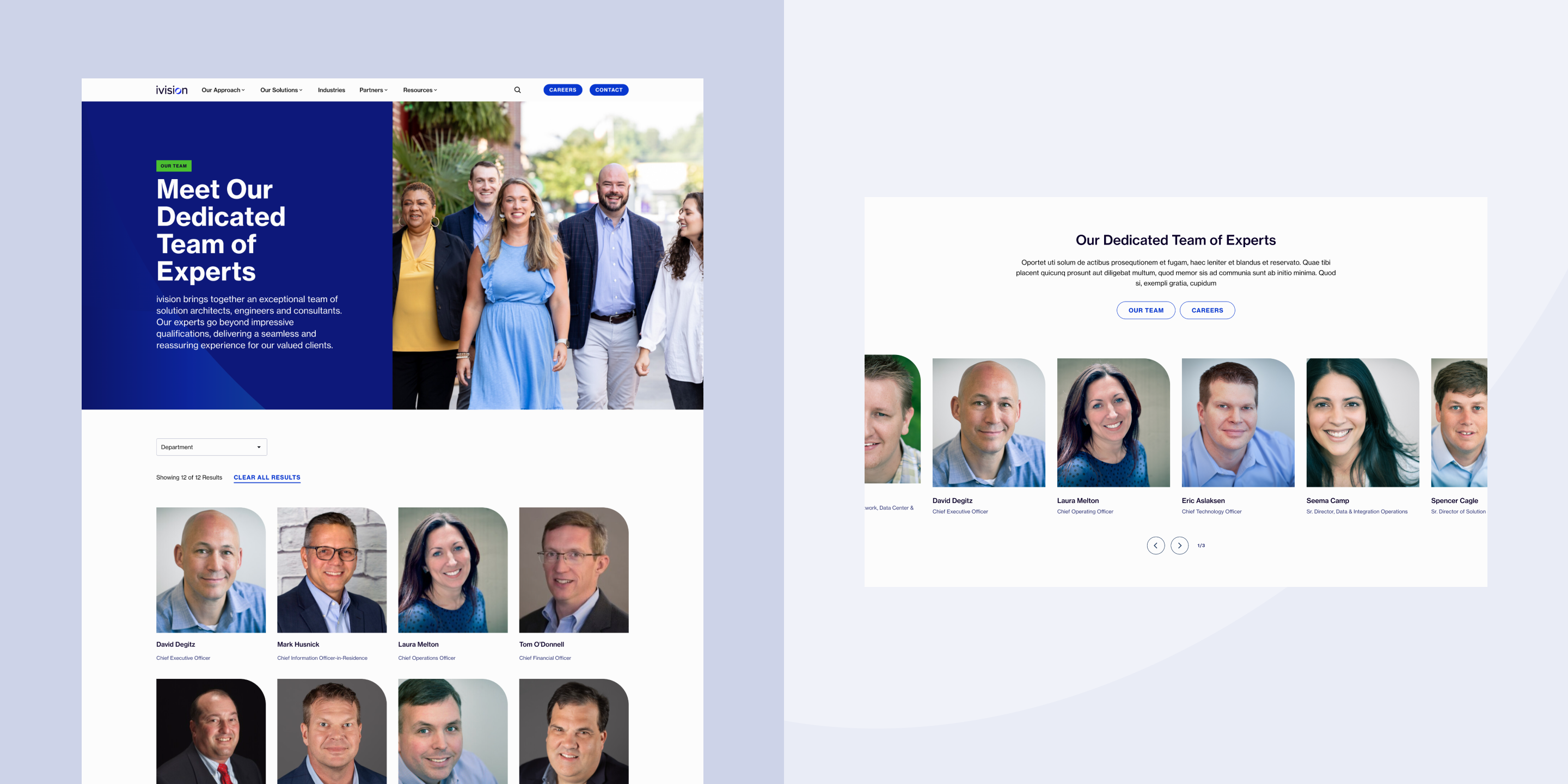
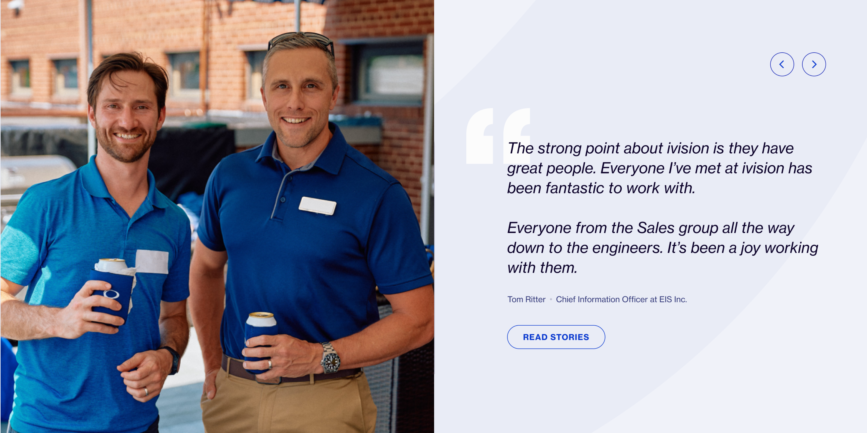
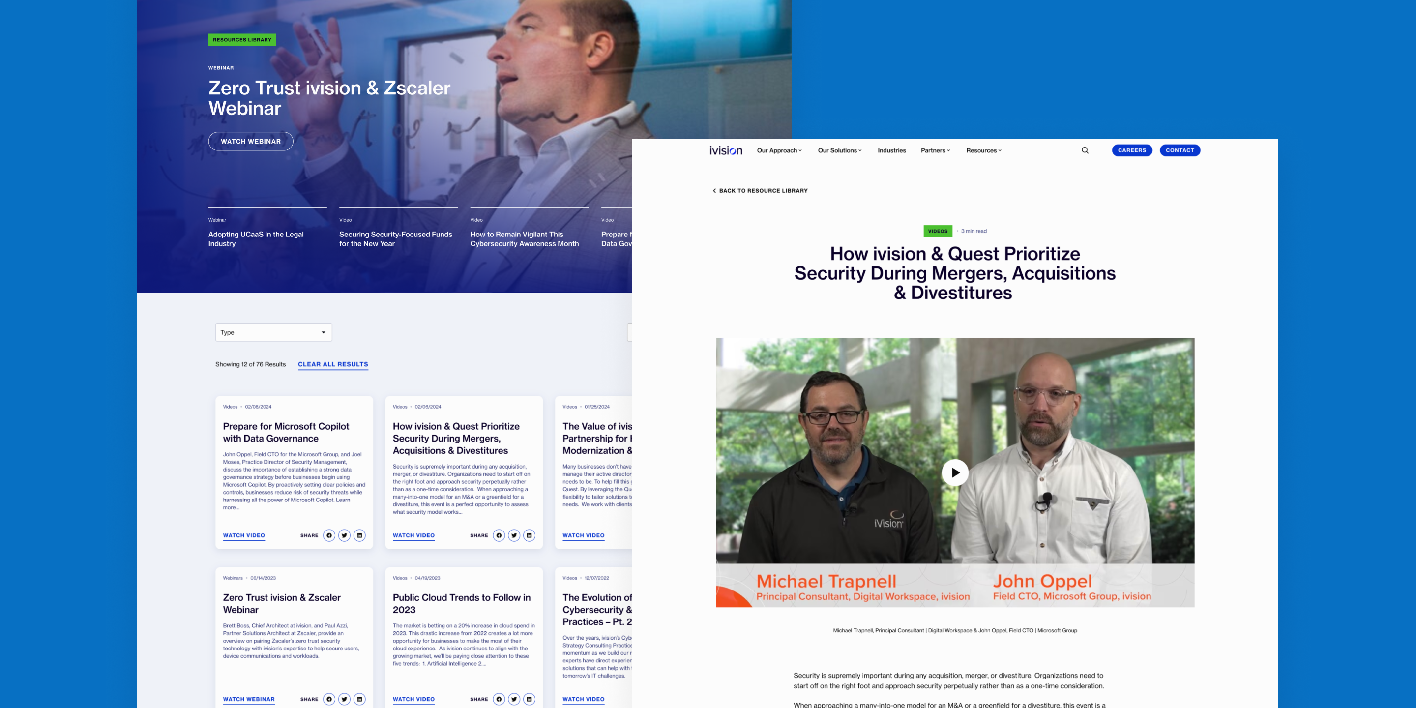
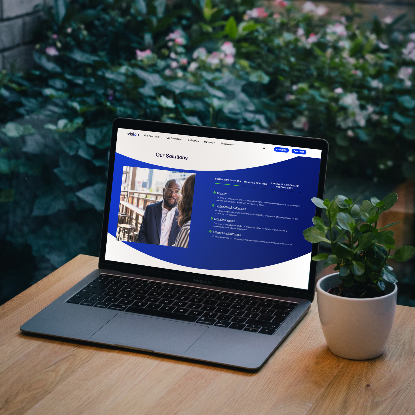
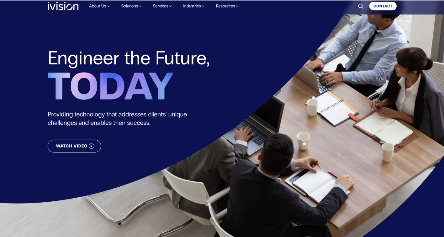
The site is built with a modernized look and feel with the addition of new features, functionality and emphasis on empathetic staff — all an extension of ivision's new brand vision and business objectives.
Research
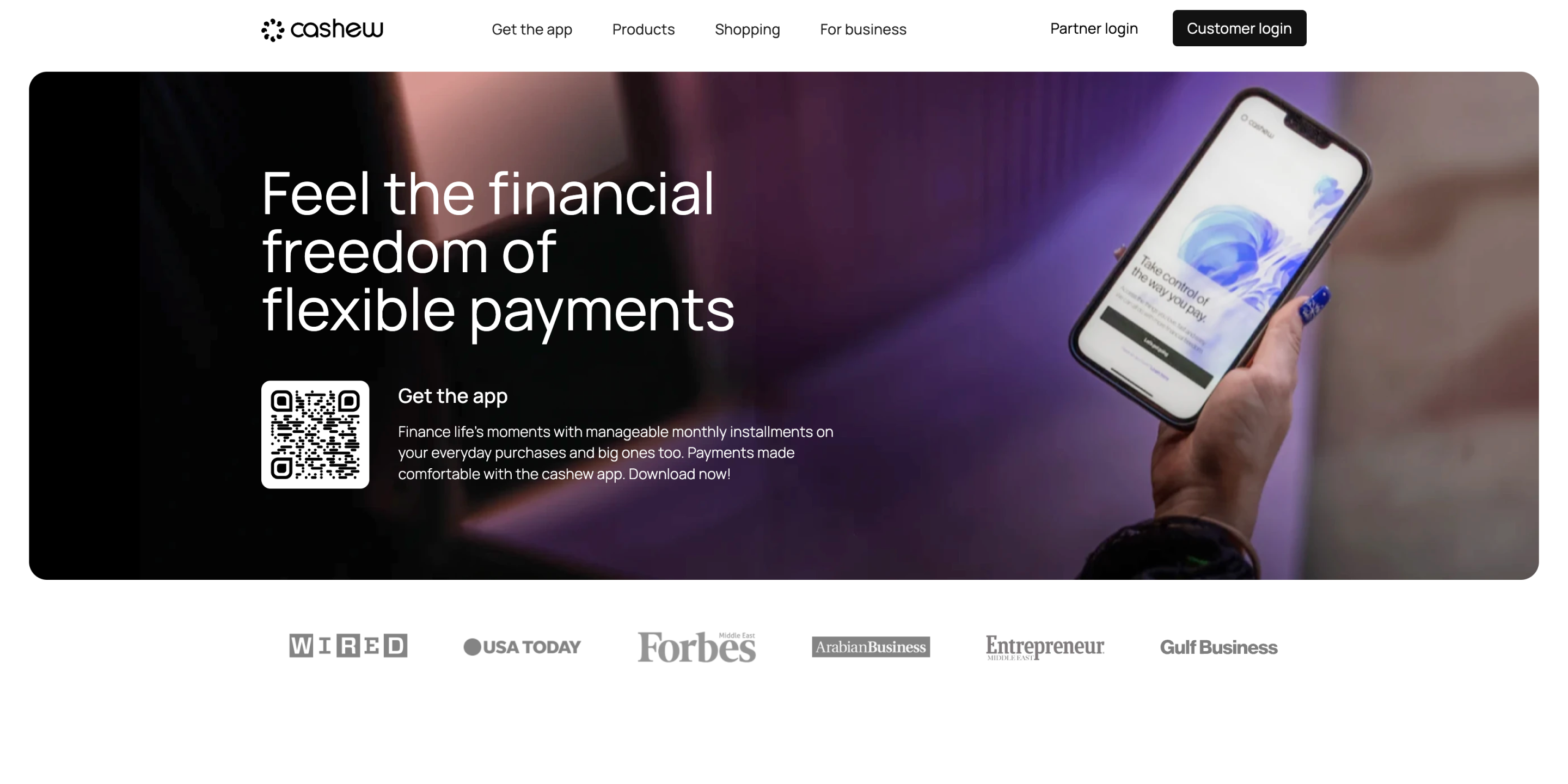
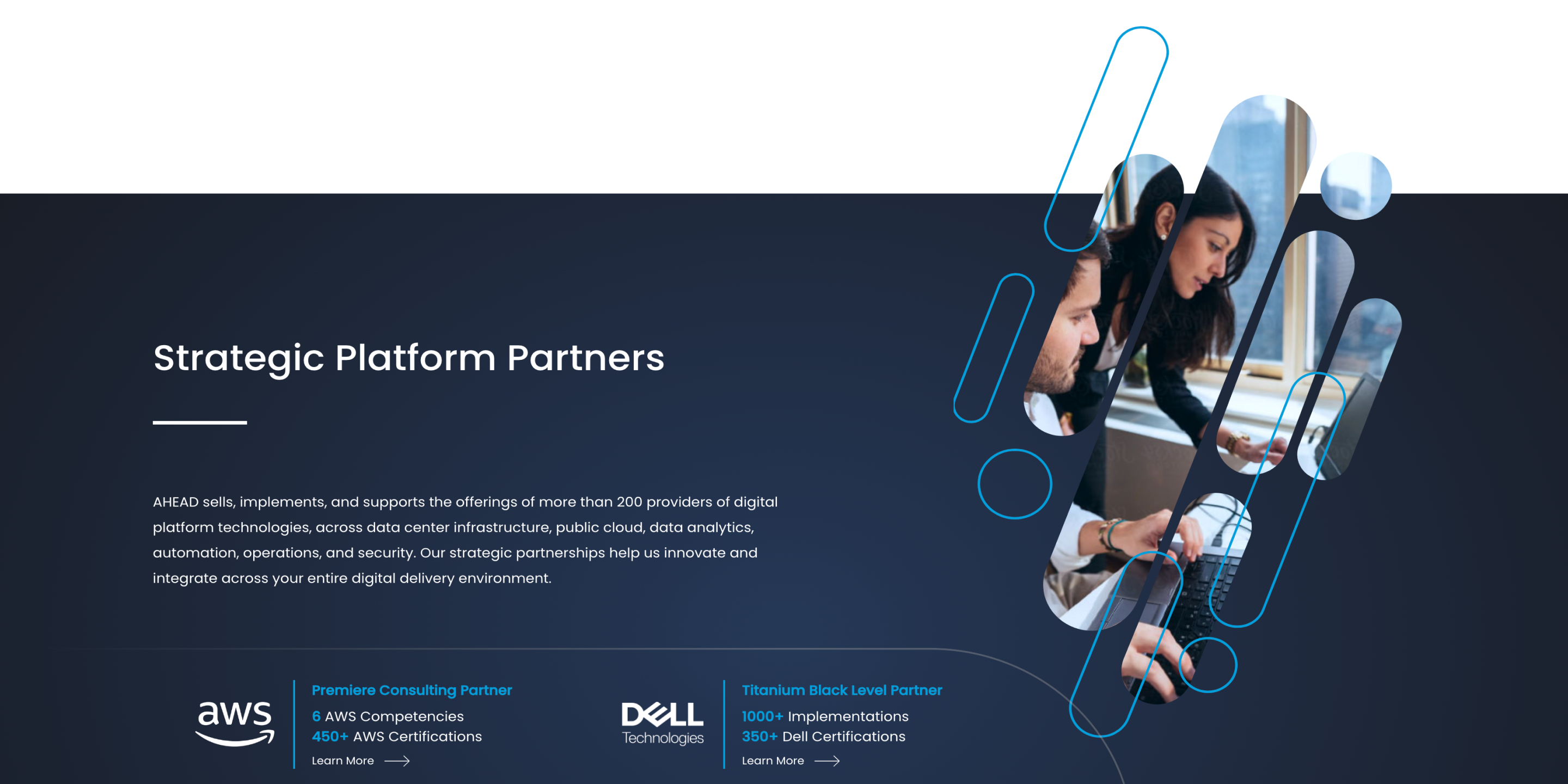
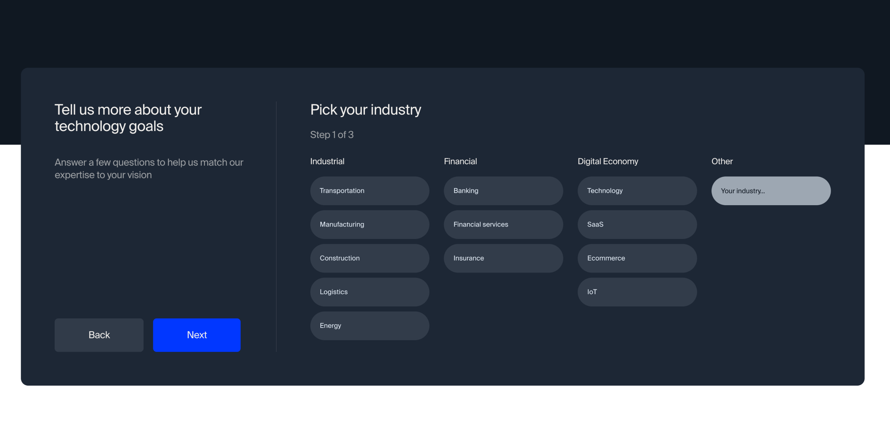
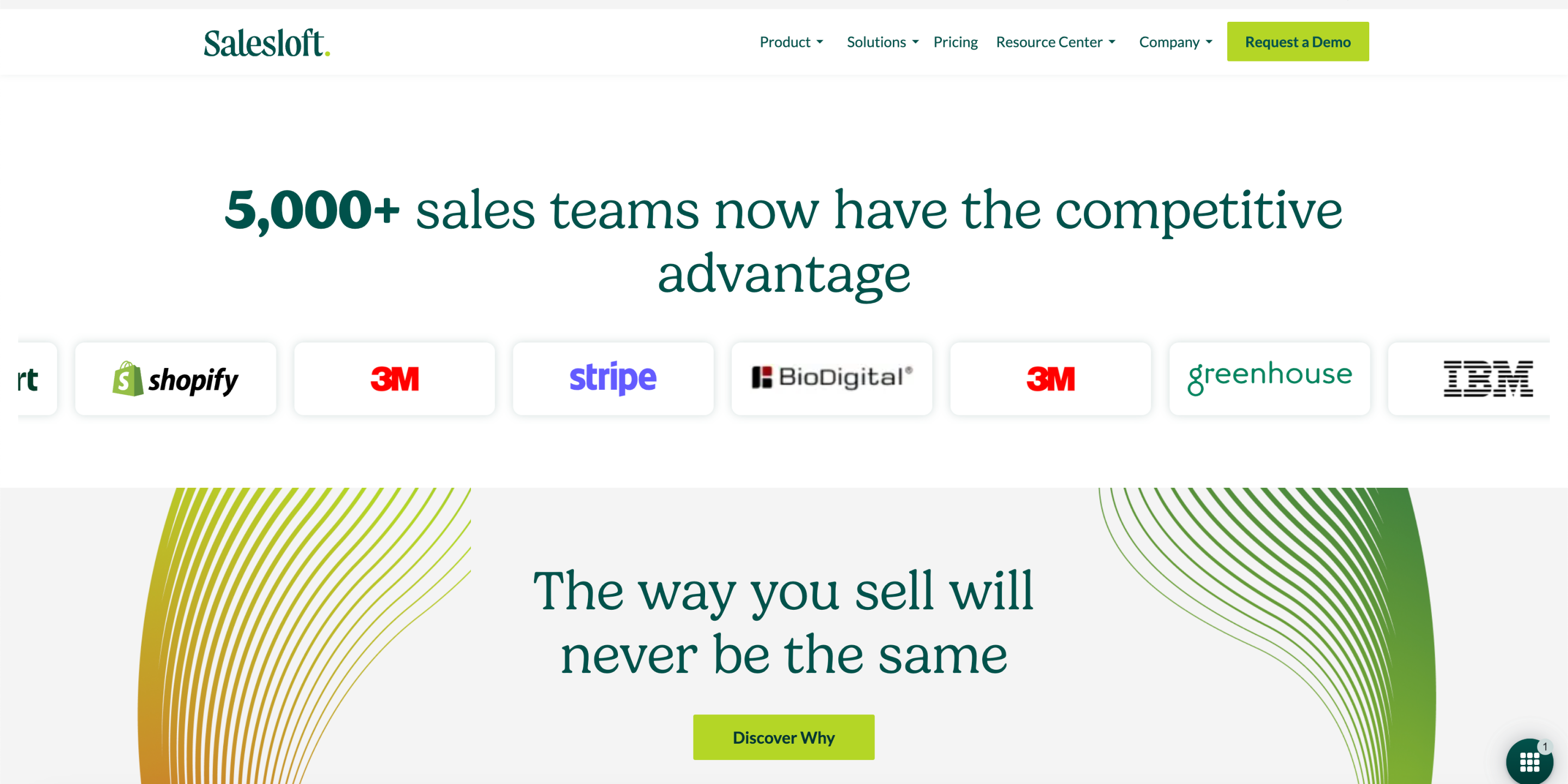
Identifying wants from competitor sites
With the identity being set in stone, ivision's team looked for inspiration in more web-specific attributes like motion, usability, and balance of imagery with content in components.
Design
Transforming wireframes to high-fidelity sketches
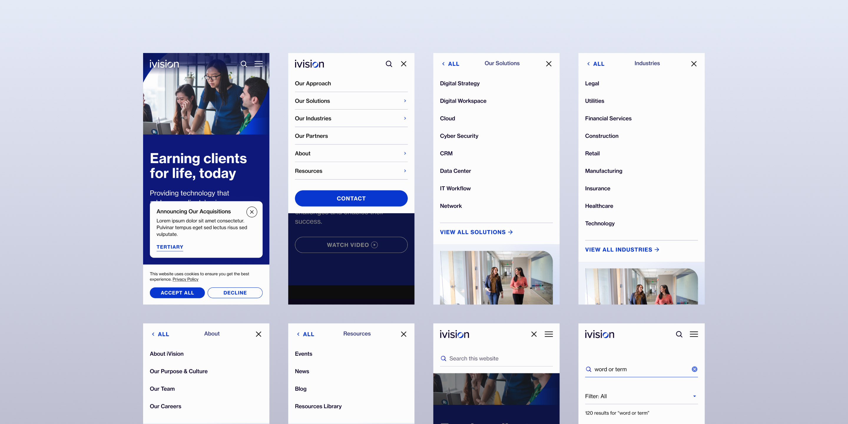
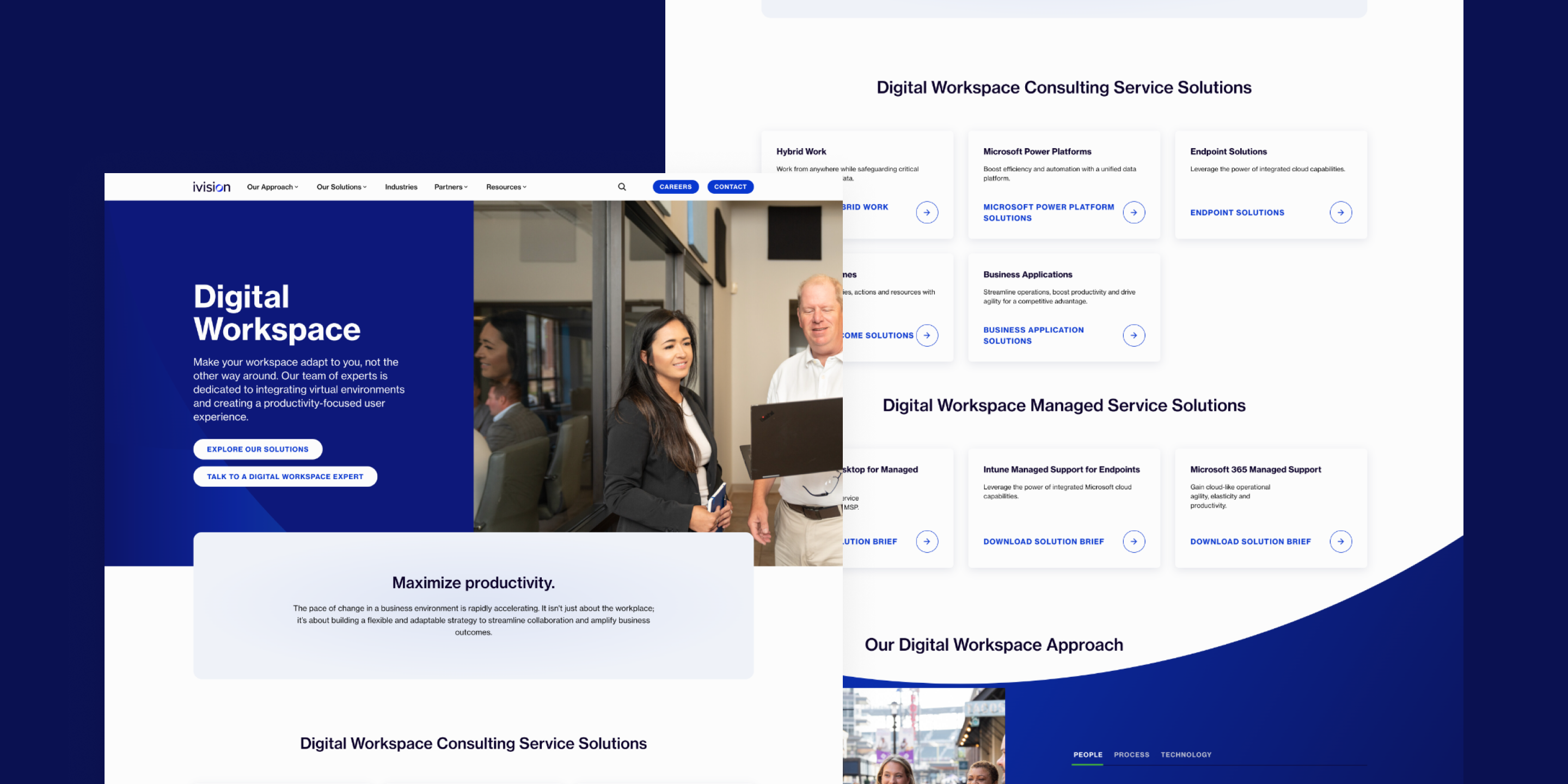
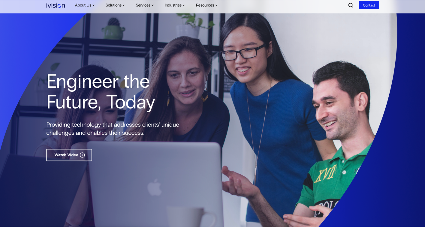
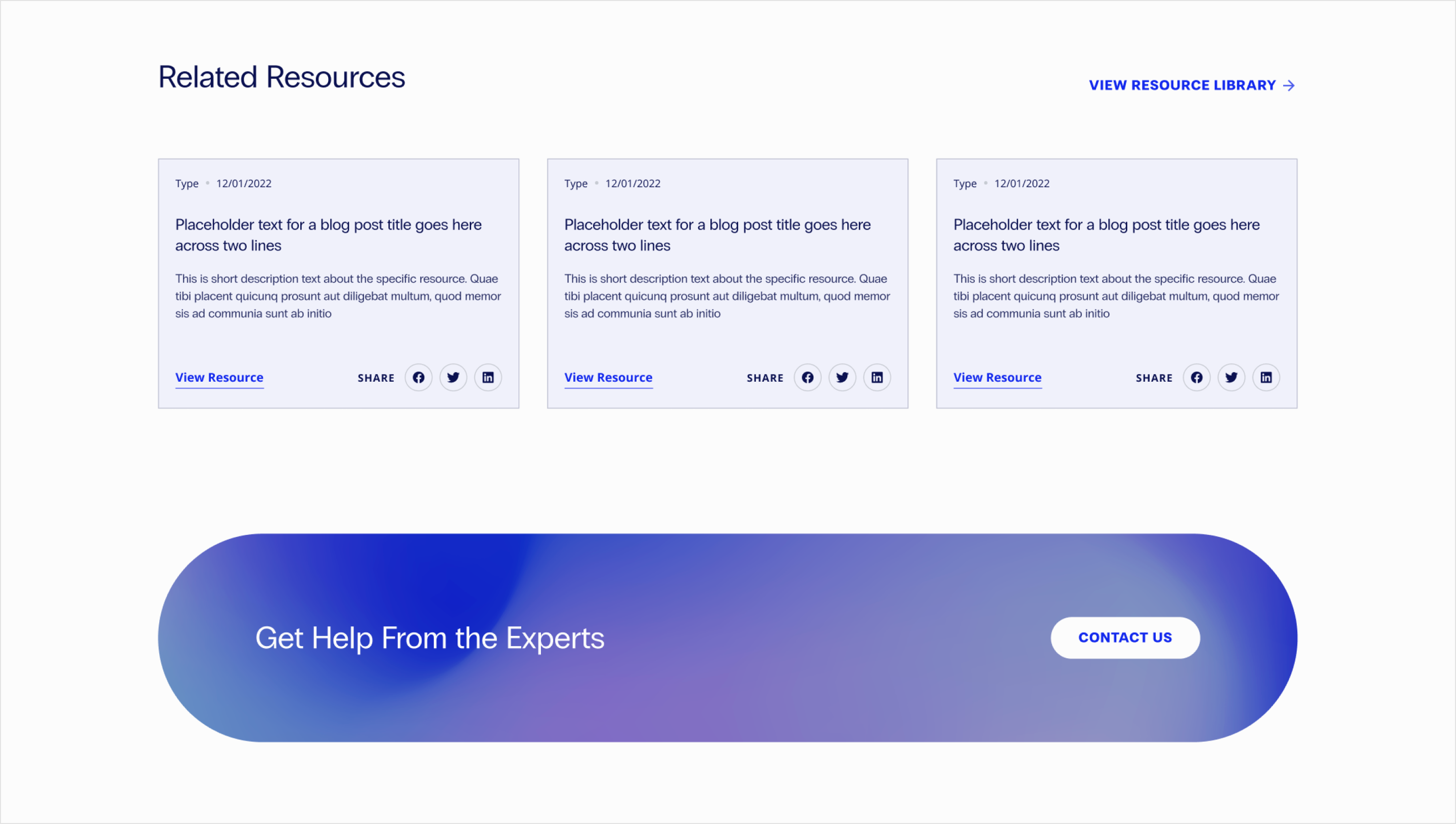
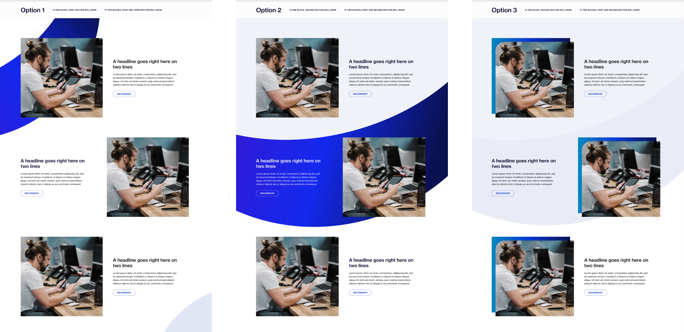
The information architecture of the site consisted of navigational elements that would highlight services and teams that contribute to client success. Exploration of visual application and stylization were done to help bring the site to life.
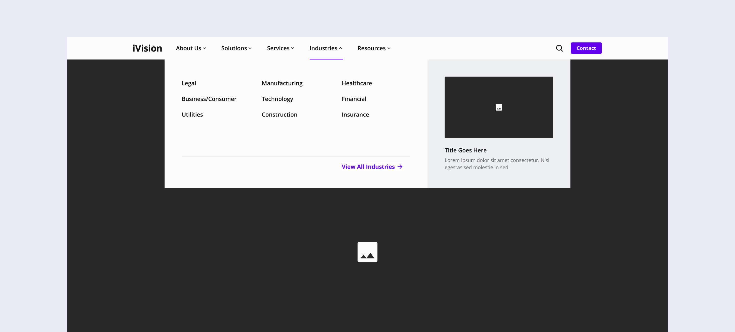
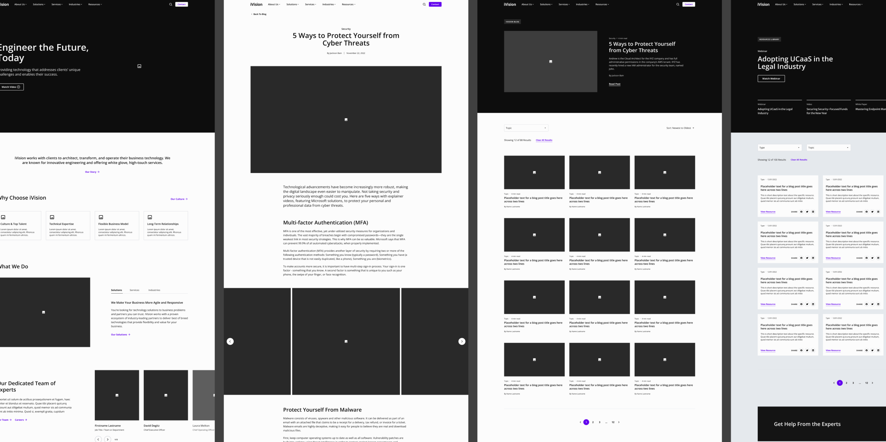


Design
Highlighting our services & the teams who make it all happen
ivision's website aims to showcase the professionalism of services and dedication to clients to guarantee success and satisfaction.
